How To Mix Patterns Like a Pro
Whoa! That title suggest that I consider myself a “pro,” which, for the record, I do not. But I definitely have a weakness for great patterns in our home. And after experimenting with them for years, I feel like I finally have a good handle on what patterns will work together and why (even before I drag them home). Since matching patterns seems to be one of the biggest “problems” us novice decorators face (and one I’m asked about fairly regularly), I thought I’d break down the various factors I consider when selecting patterns for a space. From color and scale to relying on solids and trusting your gut, here is how to match patterns like a pro!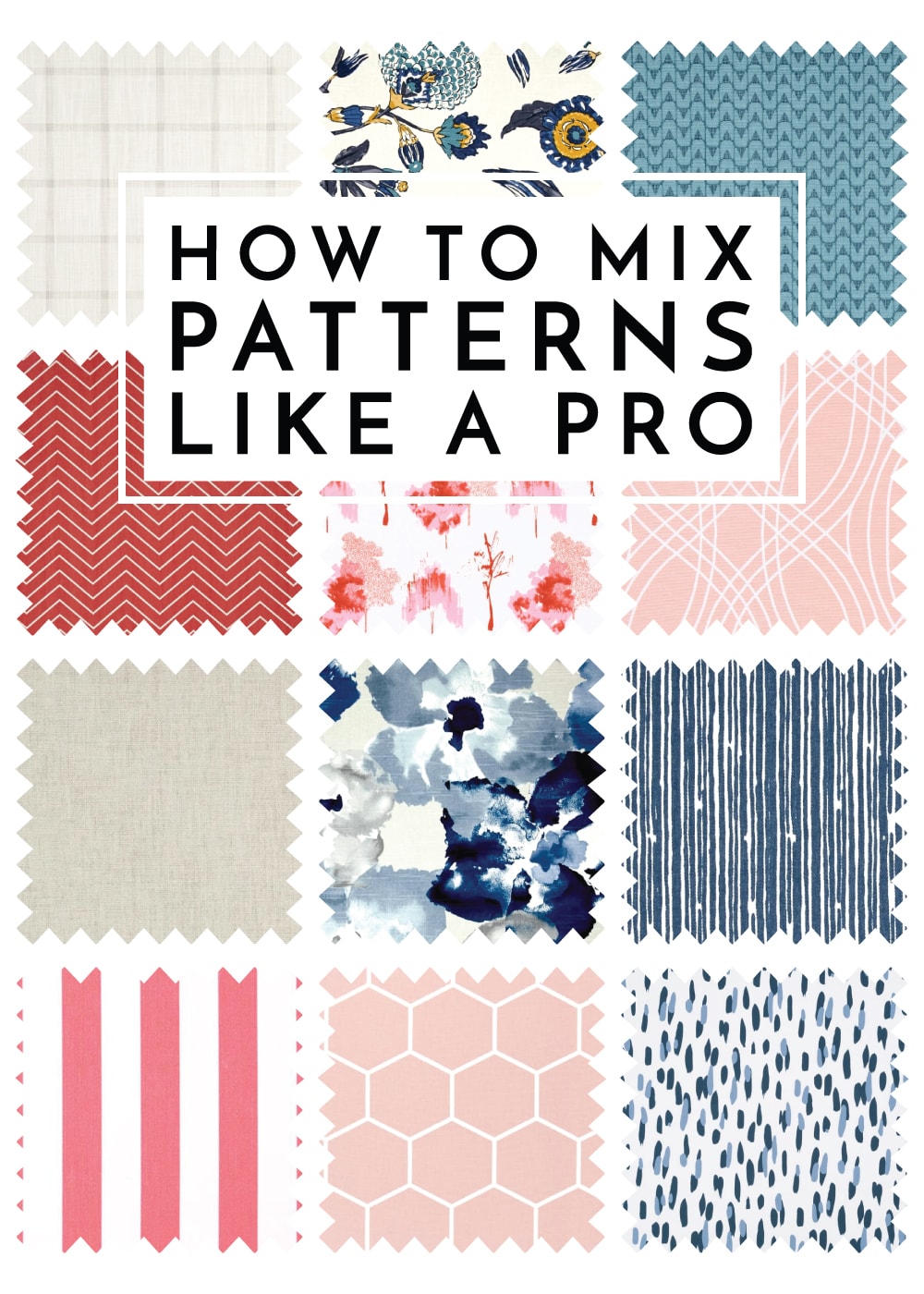
Show & Tell
Before I dive into some practical, tangible steps, first let me suggest that mixing patterns takes practice. Seriously. You don’t need a degree in design or color theory, although I’m sure those would help! Still…mixing patterns is just something you need to play with and work at until you find specific combinations and a “level” of pattern you are comfortable with.
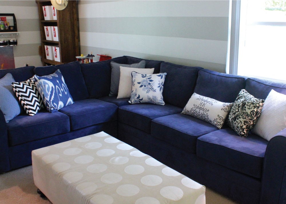
For example, below is a photo from the early stages of our North Carolina family room. Although I followed a lot of the “rules” I will outline in this post, it doesn’t take a design guru to see that there is a lot going wrong. From the walls to the pillows to the ottoman, there are a lot of patterns in play; and while I wasn’t sure exactly why, I knew I didn’t get it right.
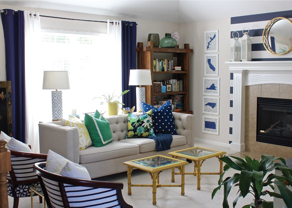
I literally spent three solid years trying to get the patterns right in that NC family room (you can see where it eventually ended here). Although it took a while, I tried so many different combinations and worked through so many failures, that I ended up learning a ton about my pattern preferences and how to ultimately get it right. Because of those struggles, when we moved into our next home, I was able to (quite quickly and easily) pull together a room that featured lots and lots of different patterns in a really successful way. Our Kansas family rooms is one of my all-time favorite spaces ever, particularly because of all the patterns used.
If you’re ready to infuse your spaces with some serious style, here are my best pointers for embracing and using pattern!
NOTE: While I will mostly show and refer to fabric patterns in this post, these rules apply to coordinating ANY patterned items in a space. From bedding to wallpaper, to tile, pillows, artwork, rugs, curtains and more, these concepts can be used to help you make sense of it all!
1. Vary Pattern Scale
This first rule is not only one of the easiest to implement, but is also the one that will likely give you the greatest success. When putting two or more patterns together, vary the scale of the design. Several small-scale patterns together can look busy, while multiple large-scale patterns can feel loud. But by combining a small-, medium-, and large-scale pattern, they will all work more harmoniously in a single space.
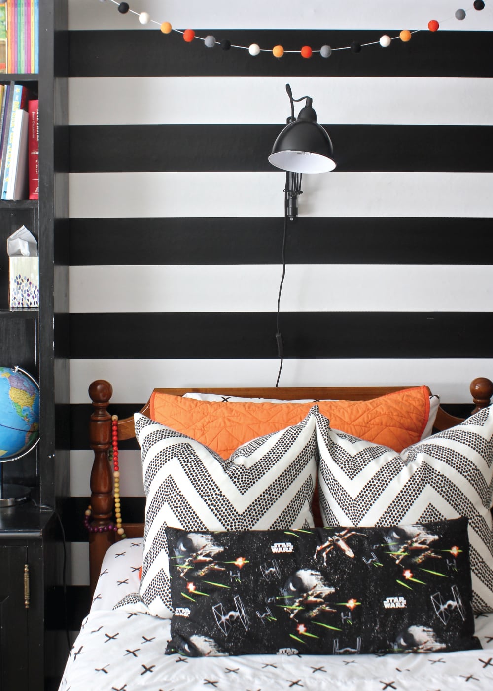
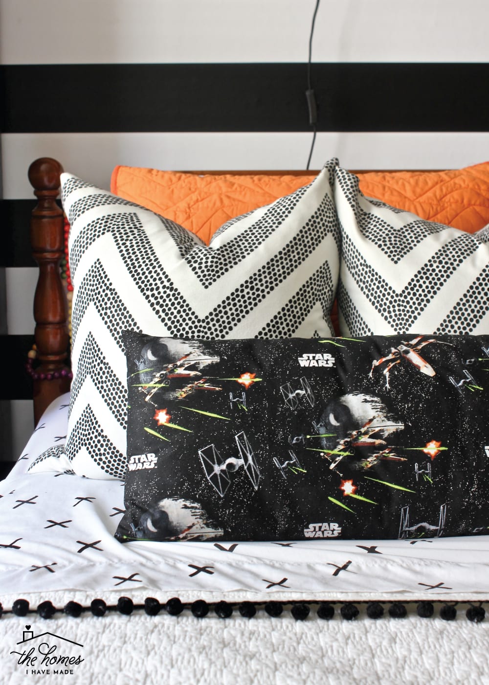
Henry’s room above is one of the best examples of this concept. There are four different patterns at play here, and they are (mostly) all in the same black-and-white scheme. Nonetheless, they work well together because of the small-scale Xs on the sheets, against the medium-scale chevron on the pillows, against the large-scale stripe against the wall. If they were all the same scale, they would blend right into each other. Here, it’s the difference in scale that sets them apart and makes the whole display visually interesting.
Pssstt – Deciphering scale when shopping for patterns online can be a bit tricky. Always look for a yardage ruler (usually available on fabric websites) or a pattern repeat on items such as wallpaper, carpets and curtains.
2. Mix Subject Matters
In addition to varying scale, it’s also a pretty safe bet to mix the design type as well. This is not to say that two or more geometric prints can’t work together, or two or more florals will spell disaster. Rather, if you’re feeling wary of your pattern-mixing skills, combining a geometric print with a more floral or organic design will usually be successful.
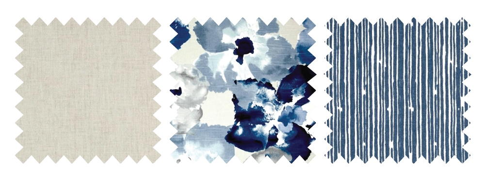
If you look through our homes, you will see that I quite often pair a busy floral design with some sort of simple geometric print, usually a small dot or stripe. For me, the geometric design almost acts as a coordinating neutral (although it isn’t neutral at all!) and really allows the busier pattern to shine while adding layers of color and interest. When mixing geometric and organic patterns though, it’s also important to heed that original tip of varying scales! So…a tight geometric print with a large-scale watercolor motif will work great…as will a tiny flower with a large-scale stripe. Are we getting the hang of this yet?!?
3. Connect (at least) One Color
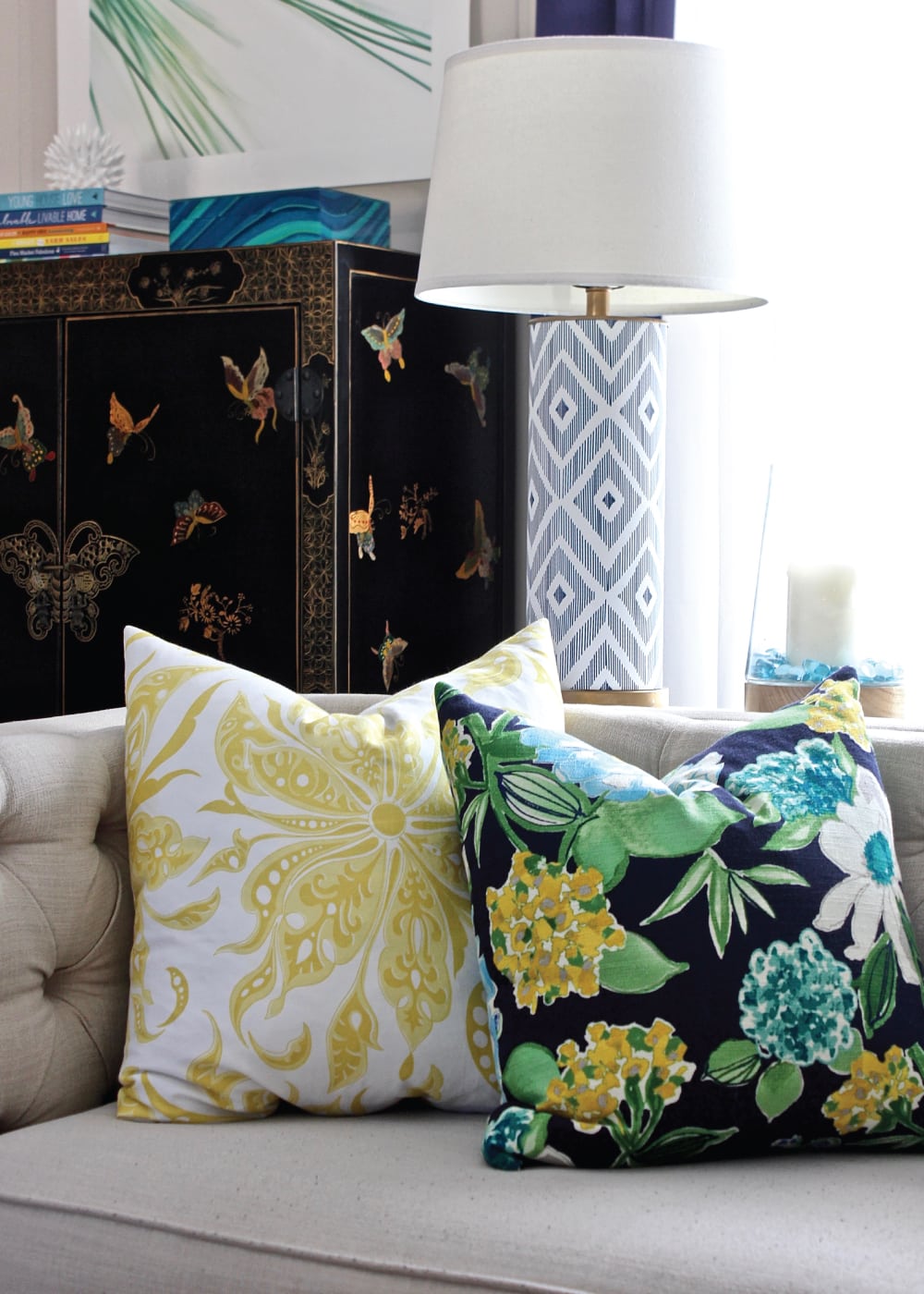
This one is probably a no brainer: if you want your series of patterns to go together, try to connect at least one color from one item to the next. This is not to say that each item has to feature all the same colors, nor does it mean that every single color from one pattern has to be represented somewhere in the room. But by ensuring that each pattern in the room is connected to another, somehow, they will all feel much more cohensive and coordinated.
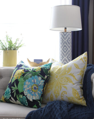
I find this concept easiest to execute when you have a single multi-color pattern in your space. It can be a pillow sham, the curtain fabric, a wallpaper, anything. In the photo above, the one and only multi-color item in the space is the floral pillow on the right. Every other pattern in the room is somehow connected to this pillow via one color. The yellow-and-white pillow, the blue-and-white lamp, the green-and-white artwork, and even the ombre-turquoise stones in the candle holder all work. Not because they share any common element, but because they all connect back to the floral pillow. And notice that geographic prints are mixed with organic prints, and the scales are changed up as well!
4. Use Color Theory
While connecting colors to a single multi-color pattern absolutely works, you don’t always have to have a busy pattern in your space. If you find yourself drawn to monochromatic motifs or color+white designs, you can still combine them successfully! This is where a visual of the color wheel comes in handy! (I’m not going to dive deep into basic color theory, but this is a great overview to familiarize yourself with the concepts.)
Want to save this post?
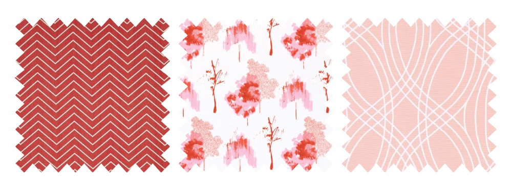
Basic color theory (in a really watered down interpretation) is as follows: to find colors that work well together, choose colors that are either 1) across from each other on the color wheel (complementary colors); 2) next to each other on the color wheel (analogous colors); 3) Make a triangle or rectangle of colors on the color wheel (triadic or tetradic colors); or 4) are tints and shades of the same color. By picking several single-color patterns that follow one of these color rules, they are likely to work together (but be sure to vary up those design motifs and scales as well!)
5. Rely on Collections
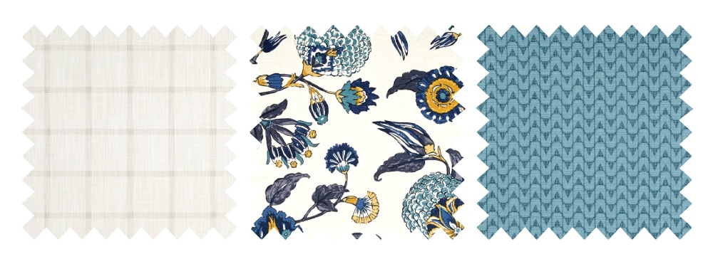
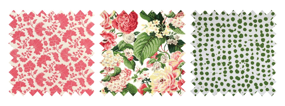
When I first got into playing with patterns (and quickly realized I wasn’t very good at it!), I built my confidence by relying on fabrics that were designed to work together. From quilt fabrics to home decor materials, it is not difficult to find “collections” of fabrics…they are usually grouped together at the store or there will be a “See More from this Collection” button on the website. Since these groups of fabrics are specifically designed to work together (from a color, size, and scale perspective!), you pretty much can’t go wrong!
When I am putting together fabrics for a room, I will always check to see any of my selections are part of a bigger collection. While I may not use any or all of the coordinating fabrics, they provide a great jumping off point for identifying patterns and colors that look good together.
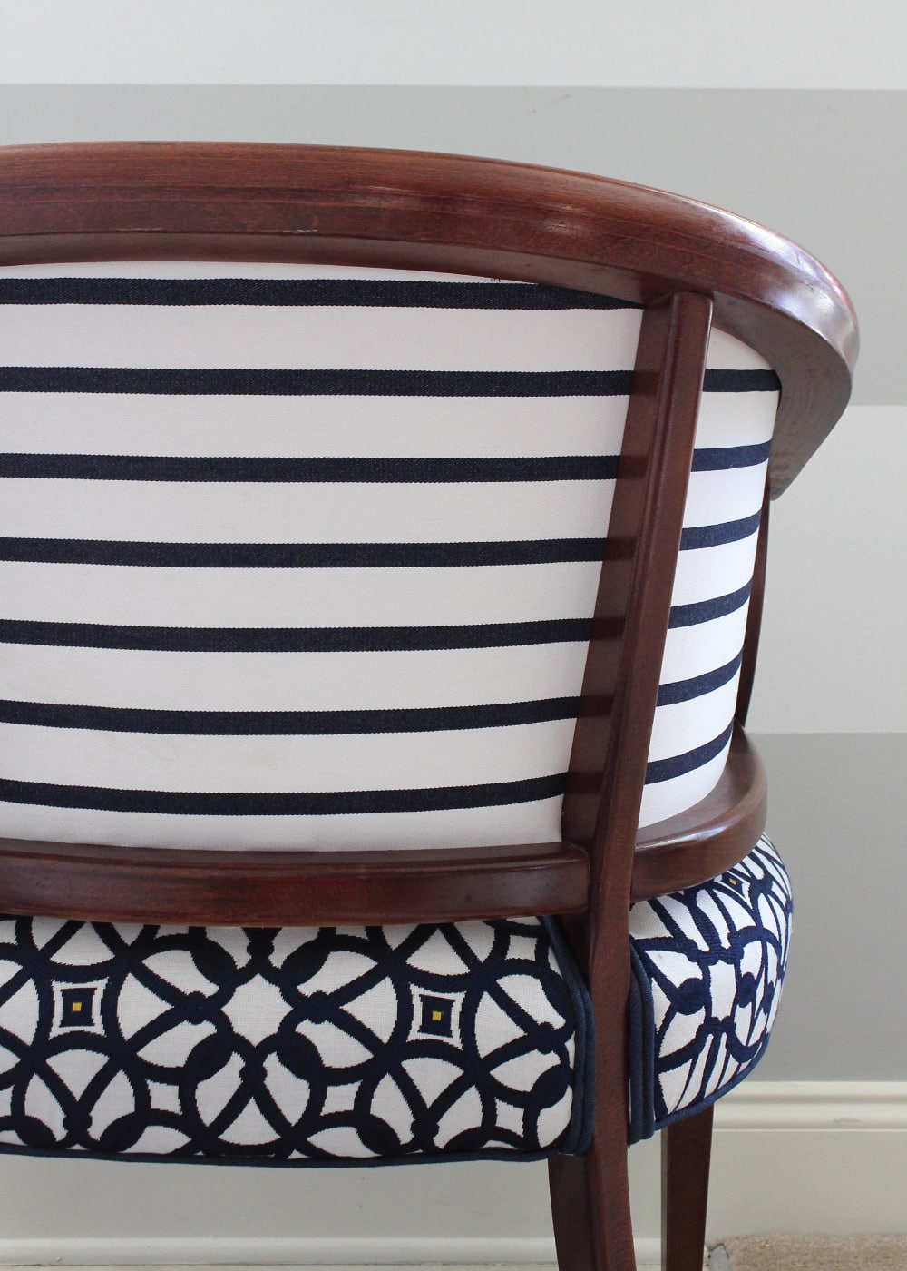
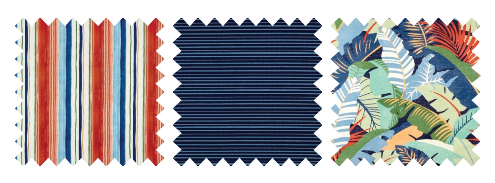
I especially like to use collections of fabrics when I want to be absolutely SURE two patterns work together and/or when I don’t have any room for experimentation. When I had my favorite chairs reupholstered, I didn’t want to take any risks of colors not matching or pattern scales being off. As such, I specifically chose two Sunbrella fabrics that were part of the same collection. These chairs are easily my very favorite items in our entire home, and it’s probably no coincidence that it’s one of the times I trusted the experts to get it right!
6. Incorporate Solids
Okay, okay, I know solids aren’t patterns, but they can be your very best friend when you are trying to get a series of patterns to work together. In the same way that white space in a room gives your eye a “place to rest,” solids help bring a pattern scheme together without causing more busyness or distraction.
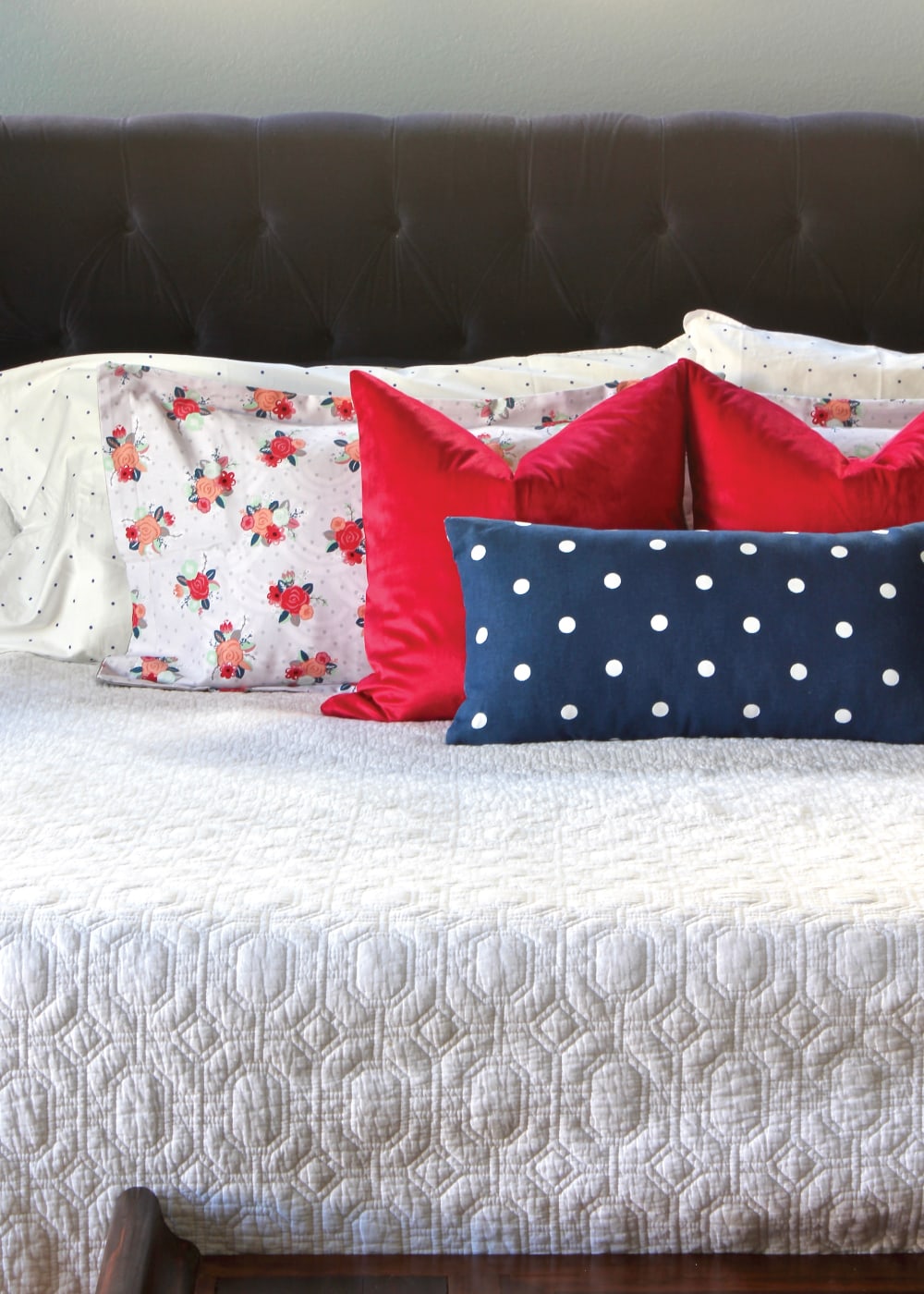
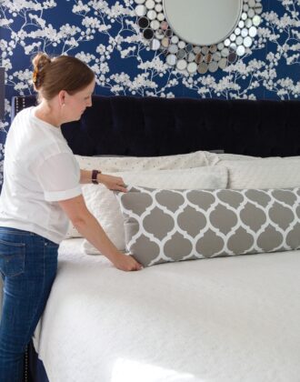
One key trick to incorporating solids in a really successful way is to vary their texture from the other patterns in the room. On our bed above, the solid red pillows have a velvet texture. The solid green pillow in our Kansas family room is linen, and the solid sham on Henry’s bed has a subtle embroidered design. Even if you’re not dealing with fabrics, you can make a solid interesting by choosing matte, glossy, or textured versions of your object!
7. Vary the Background Color
Let’s go back and look at the patterns on Henry’s bed one more time. I talked about how the black-and-white sheets, square throw pillows and wallpaper all work together because of their different scales. But what about the Star Wars bolster pillow out front?
Although the scale of the Star Wars pillow is slightly different from the other patterns in the space, it primarily works because it has a different background color than the rest of the patterns. By selecting at least one pattern with a colored background (rather than white or cream), you create contrast which can help break up too many patterns that look similar!
8. Test It Out
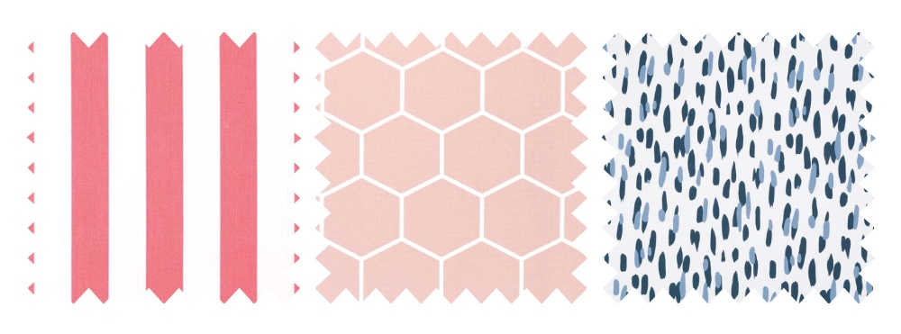
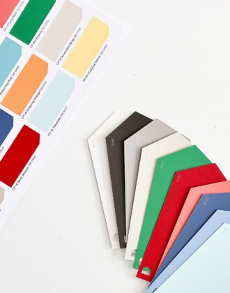
I’ve gotten much better are predicting what patterns will work well together and which ones won’t…even before I bring them home. But if you are new at matching patterns or are working on a “high stakes” space where you really don’t want to get it wrong, nothing beats ordering swatches, samples, and/or keeping your receipts so you can try the patterns out all together!
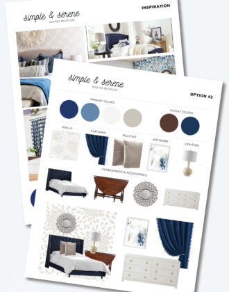
When possible, I almost always play with the patterns I am considering in a digital format first. These days, you can usually find digital pictures of items you’re considering, and pulling some simple screen shots together can give you a sense for how items will work together in real life. (You can learn all about how I put my virtual deign boards together here.)
Even after playing digitally, I will still get samples and collect everything together (before I start making, assembling, and ordering multiples) in order to make sure it all comes together exactly as I think it will! Just be sure to hold onto your receipts so you can easily return something that just isn’t jiving the way you hoped!
9. Trust Your Gut
Last but maybe most importantly, trust your gut! More often than not, I can’t explain why or how two patterns go, I just know that I like them together. In the same way, I know when I look at two patterns that “should” go together but just don’t. If you pull some patterns together and your heart does a little flutter each time you see them, then you probably got it right. If your eye keeps going to them over and over again and you can’t figure out what’s bothering you, your mixing probably needs some tweaking! Don’t beat yourself up or give up all together. Try swapping out one of the patterns (probably the one you like the least) for something else until you find a combo that works just right!
All in all, pattern mixing isn’t an exact science. But it can be oh-so-fun, and the results can be oh-so-worth it when you get it right! If you are scared of pattern or are too nervous that you’ll get it wrong, I hope these tips and tricks give you some courage and confidence to give patterns a try! I know this is coming from a gal who will ALWAYS add a pattern over a solid…but I promise you won’t regret it!
Megan


6 Comments on “How To Mix Patterns Like a Pro”
This is so helpful! It’s exactly what I needed, though I didn’t realise it before. I’ve been living with one couch cushion I love and six that are the right size but awful for five months already. One of those cushions doesn’t even have a cover, I’ve been looking at a cushion insert all that time. Now I’m ready to get to work and know what to start looking for!
This was well explained! Like a lot of people I’ve often avoided bolder or busy patters as I wasn’t sure how to make them “go”. Thanks for the easily understood and actionable directions!
Now, if I can just get my family to love pillows just a liiiiiittle bit more, I’ll be set! 🙂 It’s a struggle to just keep two! on the couch and not tossed in a corner
This is so helpful! And then age bottom I found the link to create design boards. I can’t wait to revisit my living room! I have had the same pillow covers on there for years and want an update. Now I have some tips and tricks if the trade!
These are awesome tips, Megan, thank you! <3
Thanks very much for this! This is really helpful, as I struggle so much to mix patterns and use colors because I’m so fearful of making bad decisions. Which could actually be a metaphor for my life in some ways… lol.
Thanks for all the tips I really appreciate it 🙏