My Easy Trick for Creating a Whole House Color Palette
As a blogger, I often fall into the trap of feeling like I have to be an expert on everything. However, I’m sure you won’t be surprised to learn that there are indeed areas of the decor realm where I struggle…a lot. Holiday decorating comes to mind; and believe it or not, picking color schemes is another! But a few years ago, I stumbled upon a really easy “cheater” way to design a whole house color palette. I’ve used this method in our last two homes (Virginia and California), and I’m using it again in our current rental. Today, I am so excited to help you move out of color paralysis and empower you to finally get some color on your walls (or pillows or bedding or wherever you want it!)

If you’re struggling to pick colors for you home, you probably fall into one of these three categories:
- You’re reluctant to use any color at all because white or beige is your “safe” and “happy” place
- You want to use aaaaaaaall the colors
- You’re completely overwhelmed by the sheer number of options
And regardless of how you feel about color, most of us are just plain nervous to get it “wrong.” After all, there is nothing worse than painting an accent wall or purchasing a sofa or selecting curtains…only to step back and find out your choices don’t work after all.
I very much fall into the second camp. I love colors and patterns so much. If you look at some of our earlier homes, you’ll see that I splashed color onto pretty much any surface I could get my hands on. And although I created some fun spaces and you all commended me for my brave and ambitious approach to decorating, these rooms never felt in harmony within the context of the house(s) as a whole.
Why Create a Whole Home Color Palette?
You most certainly don’t have to have a home that flows from top-to-bottom. If you love the look of a different color in every room, whether they match or not…you do you!
However, designing rooms that “play nicely” with the adjoining spaces (and therefor, the rest of the house) is usually key to creating a home that feels complete, sophisticated, stylish, balanced, and ultimately: comfortable.
That said, creating a “cohesive home” doesn’t mean you have to paint every room the exact same color. Rather, by picking a collection of colors that work together (without necessarily matching), you can achieve that comfortable flow while still creating a unique look in each and every room.
My (Easy) Trick for Creating a Whole Home That Flows
Picking a bunch of random colors that work perfectly together is a pretty tall task for those of us with no design experience. But I have an easy trick!
HGTV Home By Sherwin Williams Color Collections
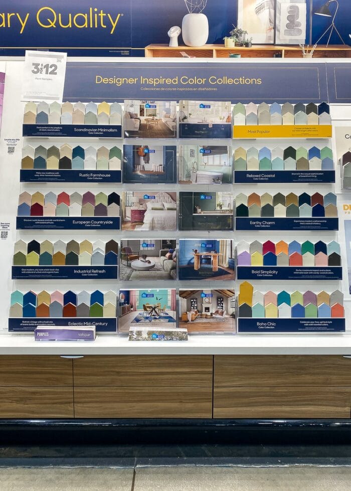
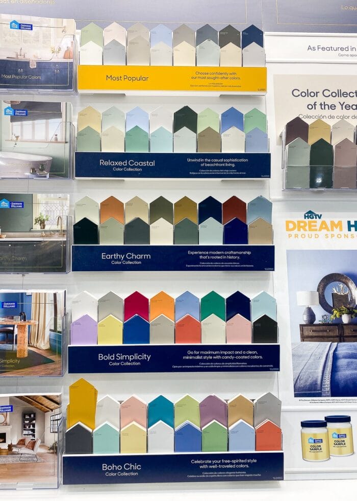
About 6 years ago (when we were moving into our very, very brown rental home in southern California), I was really struggling with how to make the moody tones of the house co-exist with my more cheerful color preferences. After exhausting my inspiration search online, I decided to wander through the paint aisle, which is where I discovered the HGTV Home By Sherwin Williams Color Collections (usually at Lowes and Sherwin Williams stores).
Likely knowing that the average, everyday decorator (like you and me) doesn’t have any formal color training, HGTV’s interior design experts have compiled color palettes of 16+ shades that are designed to work seamlessly together. There are currently 10 different palettes to choose from, ranging from subdued and moody to bright and fresh. And whether you use all the included hues across your home or just a few, these complementary color schemes all-but-guarantee you’ll have a home that flows without feeling totally matchy-matchy.
The Benefits of Using a Pre-Designed Color Palette
- All the “color theory” is done for you. There’s no need to agonize if the gray colors you’re considering for the living room have yellow undertones, blue undertones, or green undertones; or which white paint color is the best with your new couch. From tints and shades to their position on the color wheel, you can be confident these colors will play nicely.
- Countless options. With 16+ colors in each palette, there are dozens of combinations you can use to achieve a variety of looks. So whether you want a home that is mostly the same from room-to-room or different-but-it-flows, you’ll be able to make it happen.
- Save time. I don’t have time to analyze paint swatches over and over (because I ultimately find myself going in circles). Having the overall colors expertly matched allows me to commit and actually get to the projects that will bring the whole design to life.
- A guiding light. Because the palettes include a wide range of colors, you can use it as a barometer for all your decorating choices. Find a vase, or rug, or piece of art and you’re just not sure it will work? If it correlates with colors on the card, it likely will!
Other Places to Find Great Color Palettes
I love the done-for-you palettes by Sherwin Williams because they correlate directly with paint colors and provide a wide array of choices. However, you can still use this same concept using other inspiration items. Here are some different ways to find a palette for your entire home.
- Find an inspiration fabric you love. Pull different colors from the single fabric into each room. As long as everything matches that fabric, everything should work together!
- Find a piece of art you love. If the colors work in harmony on a single art piece, there’s a good chance they will work across your home too.
- Look to nature. Some of the best color advice I ever recieved was to examine nature. Look to images of the beach, forest, mountains, skies, and oceans to find shades that play well together.
- Etsy – I recently discovered that there are also a lot of “done for you” palettes available for purchase on Etsy. Oftentimes, you can search by popular color (e.g., Accessible Beige) to find a coordinating palette.
Whether you use the HGTV Home palettes, a swatch of fabric, or even a piece art you love, here’s how to use it to direct a whole-home color palette!
How to Pick the Right Palette for Your Home
Okay – sure it’s great that the color palettes are prepared for you…but how do you know which one to even pick?
Start With Gut Instinct
When presented with a range of options, there are likely a few you naturally gravitate toward. Whether you’re pulled to the moody darks or relaxing pastels, simply trust your gut and pull any cards that appeal to you at the very first glance.
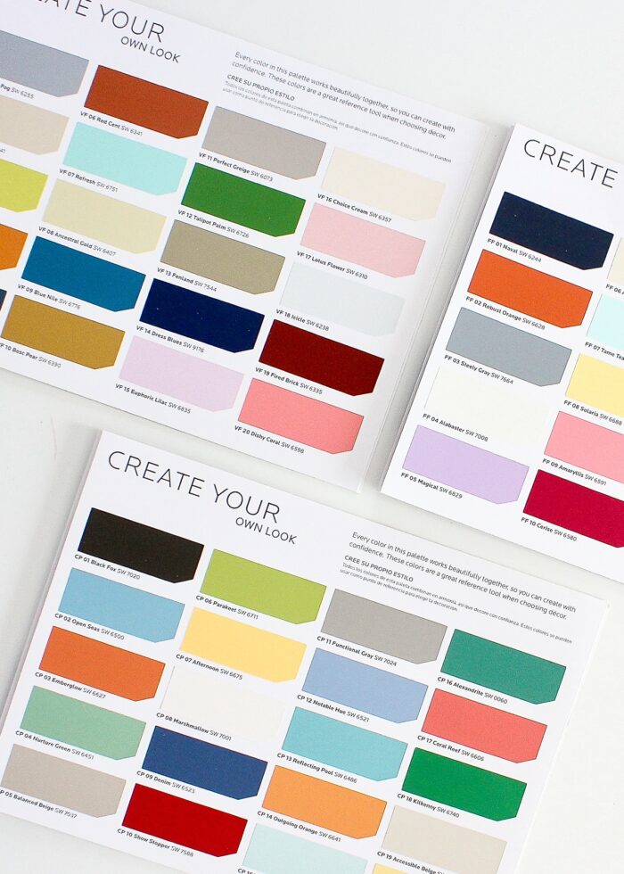
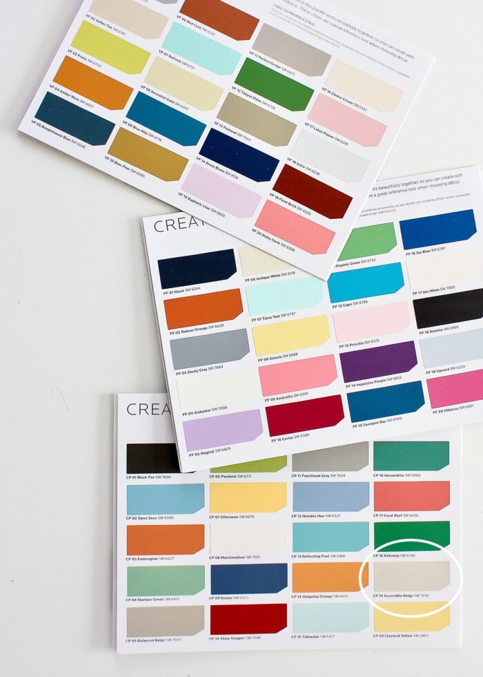
As aforementioned, I gravitate toward anything fresh, bright and bold, so I grabbed these three color cards (below) to start.
TIP! Don’t exclude a particular palette over one or two colors. Remember, these colors can be mixed-and-matched in any way you choose, including excluding certain colors all together. So if you are turned off by one shade and just can’t see beyond it, cover it up or cut it out of the card so you can focus in on the other options!
Take Your Existing Home Features Into Consideration
Whether you are painting just a few walls, making over your entire home, or falling somewhere in between, I highly recommend you bring the color cards home. Beyond just seeing how the different shades work with flooring, cabinets, ceiling, and trim colors, you’ll also want to take into account how the light in your home plays off the various hues (at all times of day).
Want to save this post?
As much as I LOOOVED the color scheme in the middle (below), I quickly determined its cool colors wouldn’t work with the very beige house we had at the time. However, the bottom card, which still felt very happy and fresh to me, had our exact wall color on the card. Bingo! Now I had 19 other colors that I could confidently use to create a home that worked with our beige walls!
TIP! Even if you’re not planning on painting any walls, these paint collection cards can still be an incredibly helpful resource. In our very beige house, we actually only painted two rooms; but we were still able to create consistency by relying on the card colors for everything else (throw pillows, bedding, curtains, rugs, etc).
How to Use a Color Palette to Create a Cohesive Home
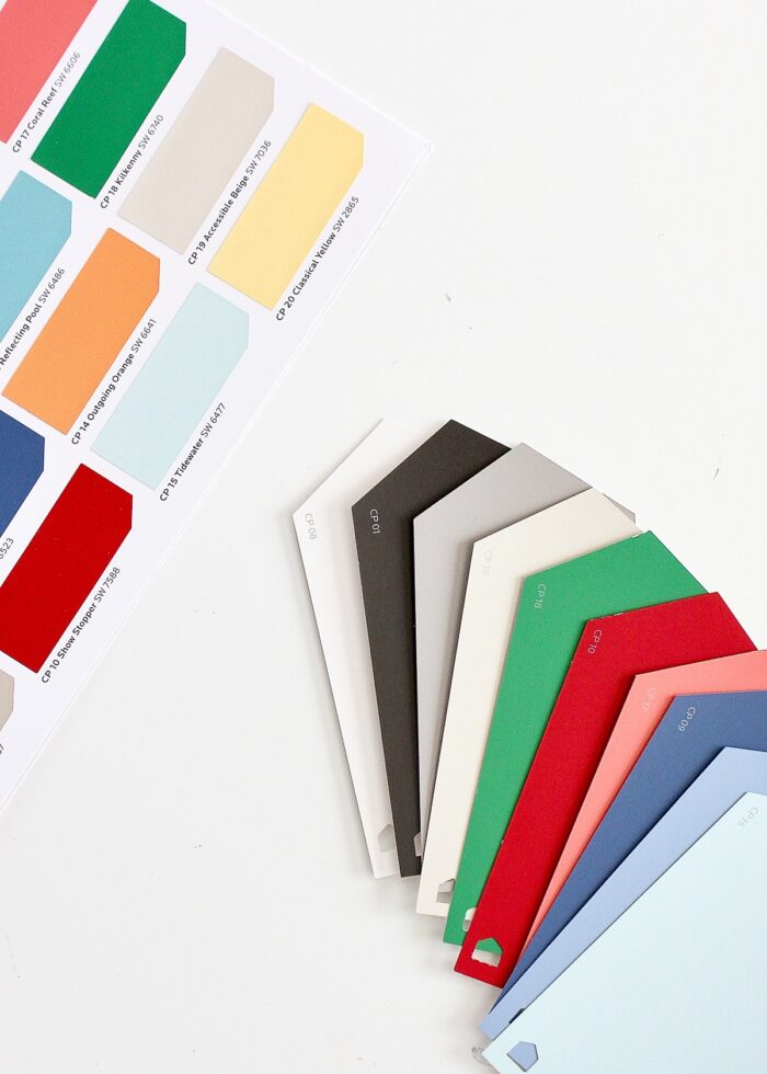
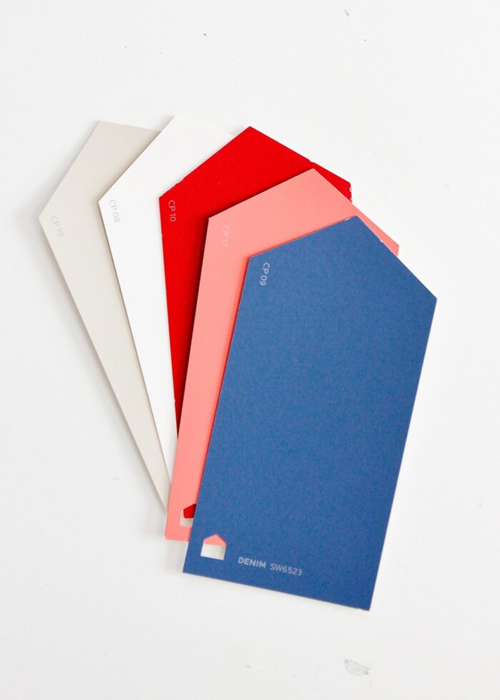
Once you pick a palette to focus on, I recommend grabbing the actual (bigger) swatch cards. With these, you can better experiment until you find combinations that really speak to you for each room.
TIP! If you are using fabric or art as your inspiration, take the item to the store and find paint chips that match each shade represented in the piece.
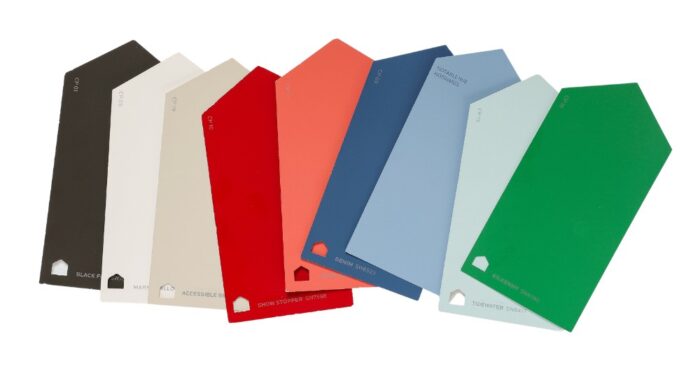
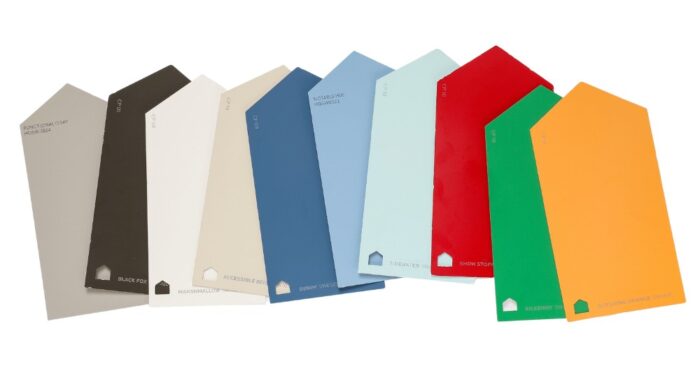
After analyzing my selected palette like crazy, I eliminated a lot of the yellow shades and finally landed on a collection of 10 main colors that not only worked within our (then) brown house, but (more importantly) provided that fun, fresh feel I crave!
Here are some things to keep in mind as you begin playing with different combinations:
- Try every combination. You might be surprised what you actually like together! I never would have anticipated using that coral pink color, but time-and-time again it was just what certain spaces needed.
- Don’t hesitate to use specific colors across several spaces. While you may not want to use the same 3 colors in every room, carrying shades across the house will provide that exact continuity you’re craving.
- Remember, not every color has to go on the walls. Your goal with these paint swatches is to find a color scheme for your whole house. Yes, you can put some colors on the walls; but you can also keep your walls neutral and bring the accent colors in through accessories and furnishings.
Real Life Examples
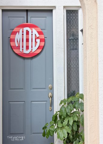
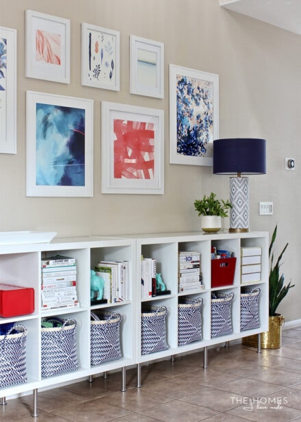
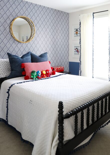
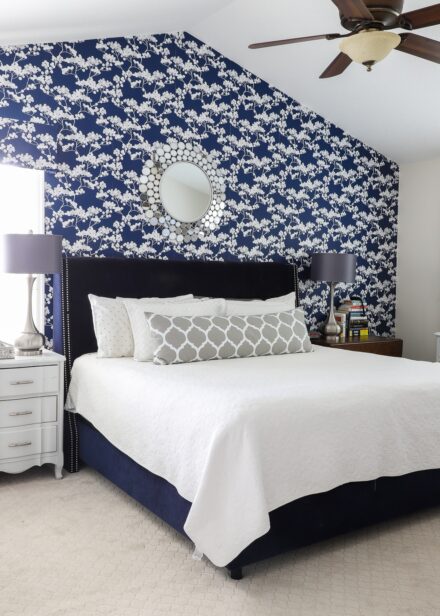
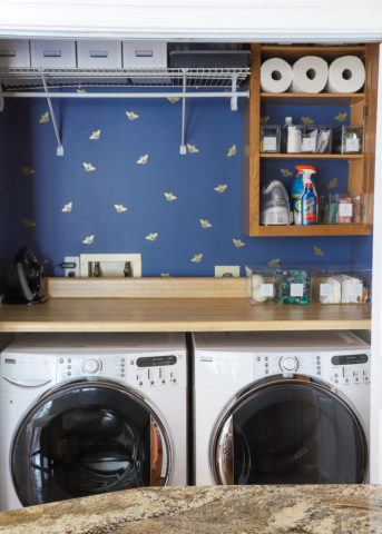
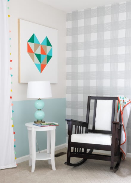
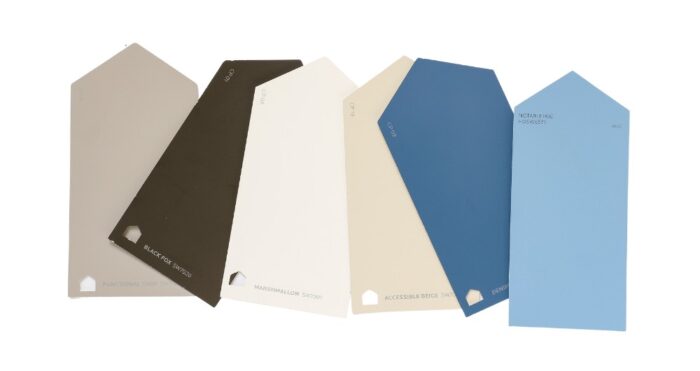
I snagged the “Bold Simplicity” color card 6 year ago, and I still carry it in our moving binder every time we move. I used it to direct our color choices both in our California home and our Virginia home, and now our current rental. Below is how the same color palette played out to create 3 different but well-coordinated homes!
Our California Home
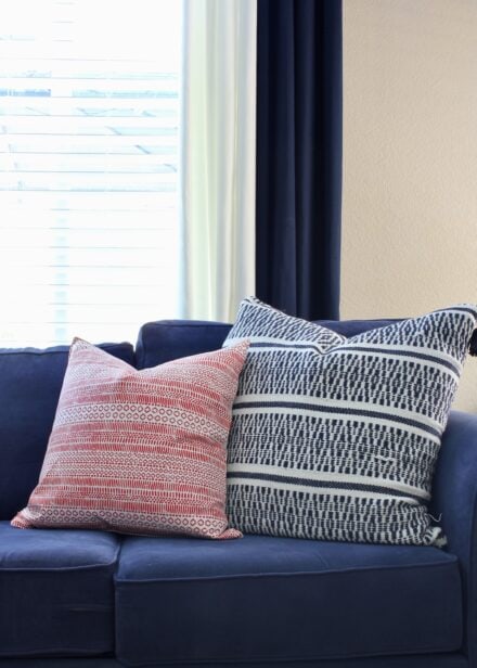
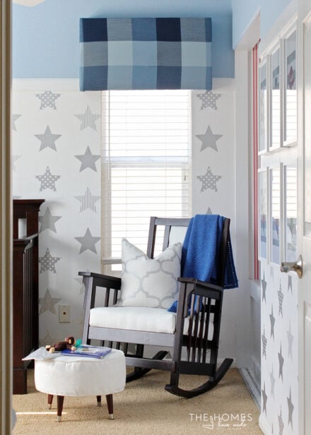
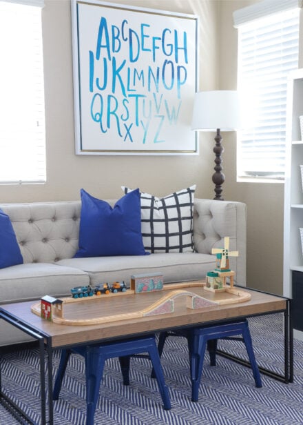
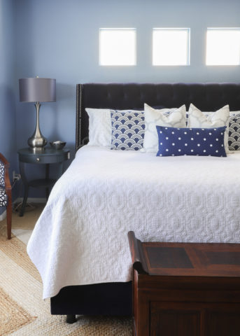
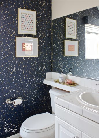
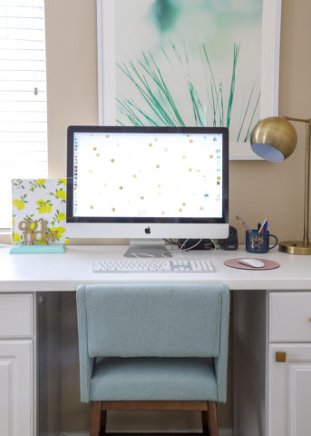
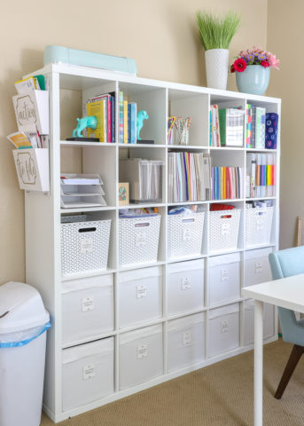
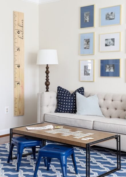
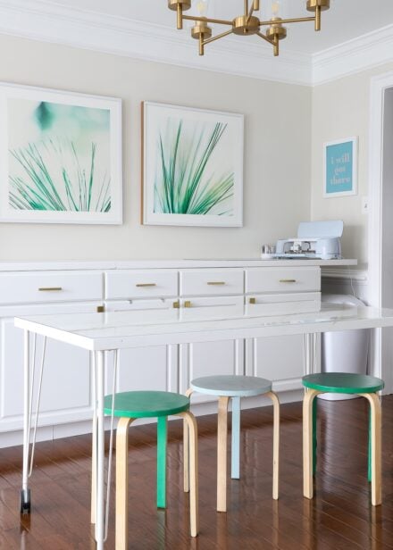
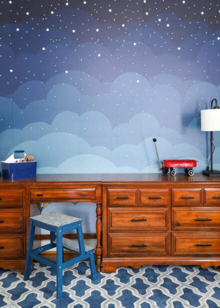
In our California home (with all the beige walls), I stuck primarily with the blues, reds, and neutrals throughout the whole house. The green and light turquoise were used primarily as accents in the office and our son’s bedroom.
Our Virginia Home
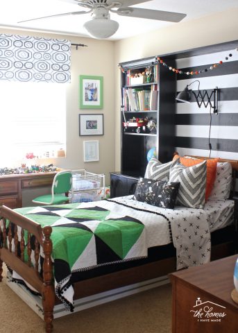
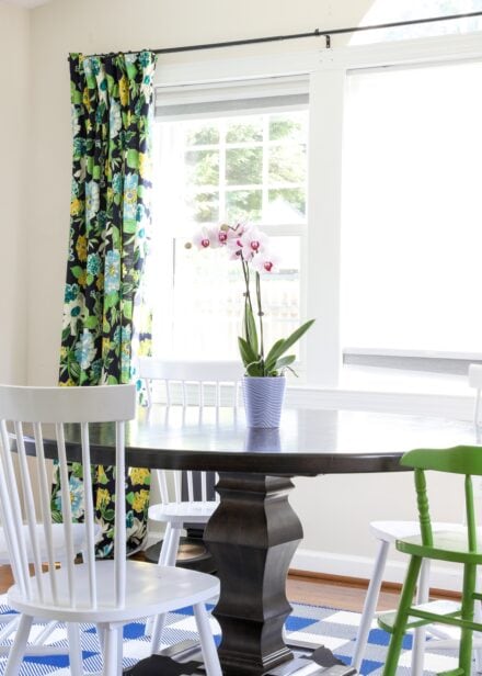
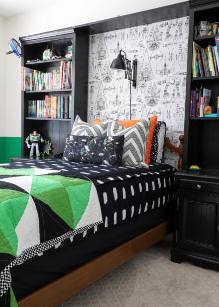
In our Virginia home, the same main neutral colors plus all the blues were emphasized from top-to-bottom, with green used in both the office and dining room. The red and orange were added as pops of color in the boys’ bedrooms.
Our Current Home
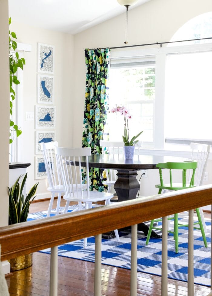
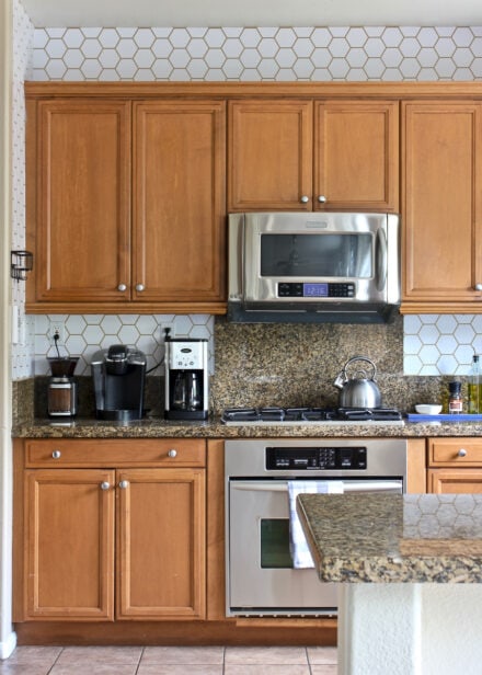
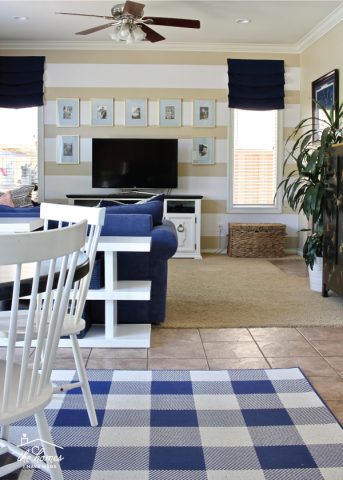
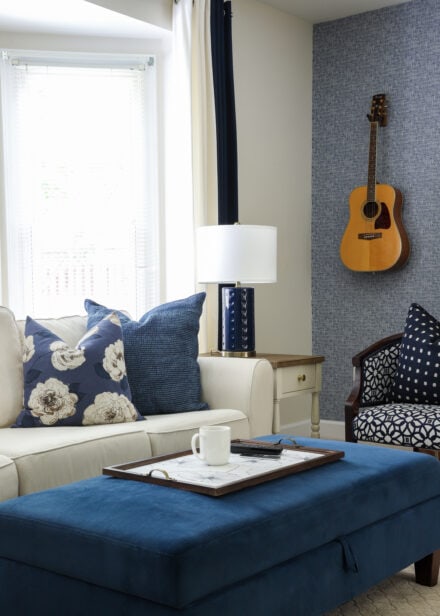
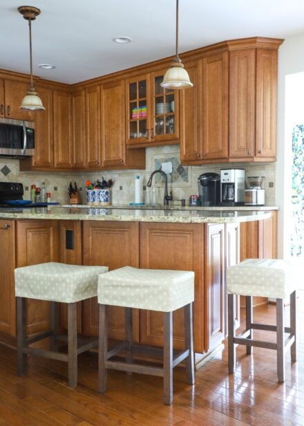
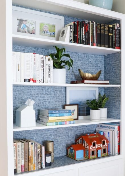
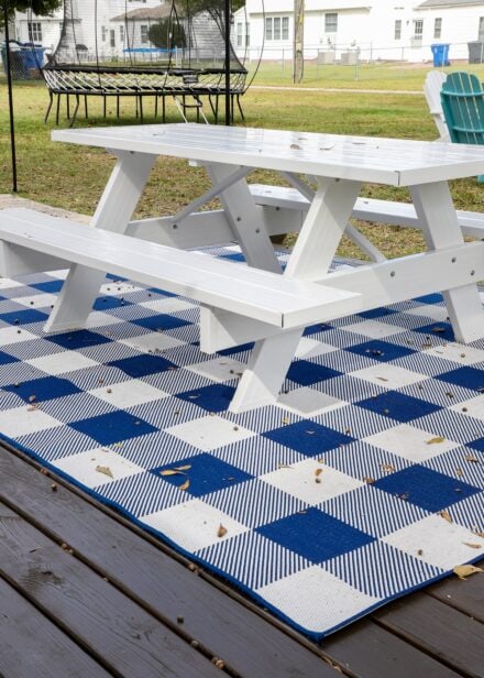
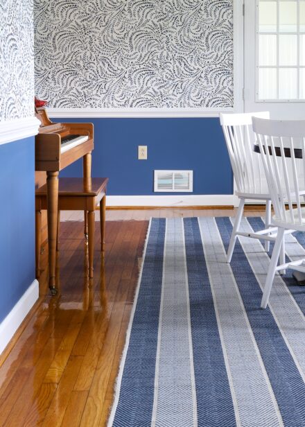
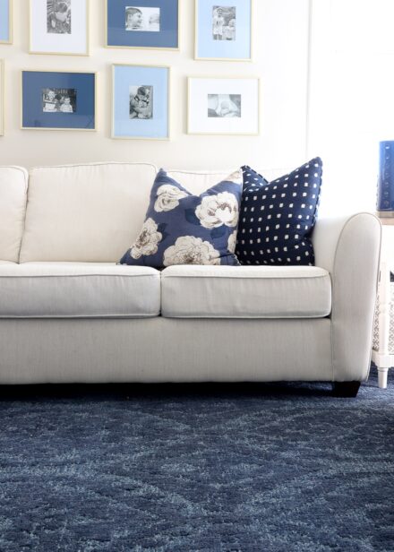
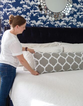
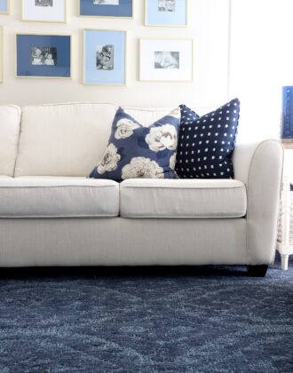
In our current home, I’ll admit I relying pretty heavily on the all blues and neutrals, with strong black accents throughout. But that’s primarily because I’m battling so much honey oak throughout the entire house (all the floors and all the cabinets). So far, everything is feeling quite cohesive, but perhaps too much so?!?
Other Ways to Create Cohesion Across the Home
Last but not least, I want to highlight that you can create cohesion with more than just color. Below are some other great ways to create subtle-but-important continuity throughout your home:
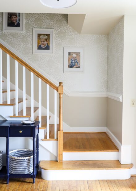
- Trim & Ceilings – Having the same trim and ceilings throughout the home provides a consistent base for all other decor.
- Metal Finishes – Pick one or two finishes for hardware, lamps and light fixtures, curtain rods, door knobs, and hinges.
- Frames – Pick one or two finishes (usually a color and a metal) for all the frames throughout the home.
- Curtains – Although I love a statement window treatment, picking the same curtains, sheers, shades, or blinds can subtly bind each room together.
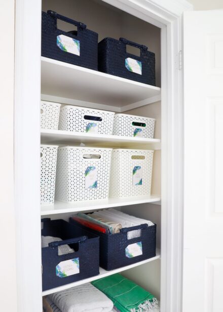
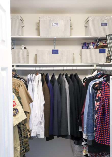
- Baskets & Containers – Pick a natural and a color for all your storage needs.
TIP! Having all of these items in similar/neutral colors means you can easily move them from room to room as the spaces evolve and needs change over time!
Picking whole house color schemes can be super tricky. I have a good bit of anxiety about getting it wrong (which I’m pretty sure you do too!); and that fear (and overthinking!) can sometimes keep me from making real progress in our homes.
As such, I’ve learned that it’s okay to let the “experts” do the hard work so I can use that time and mental energy on the projects that will ultimately bring my vision to life. By using pre-designed color palettes, I’m able to create a home that visually flows AND feels like us…but without the color stress! Are you ready to give them a try?!?
Megan



15 Comments on “My Easy Trick for Creating a Whole House Color Palette”
Oh hooray for you Megan! What a great idea, this is so helpful. I never expected to get my questions (and obviously others questions too) answered so promptly, especially with a new baby. You champion!
It is good to know I’m not the only one that struggles coordinating colors for the whole house. Sometimes I laugh because I feel like we live in an Easter egg! Each room has it’s own color palette and don’t flow from room to room. I love color but am not very good about matching colors together. You have given me some great ideas. I think it’s time to paint! Now to talk my husband into helping me.
Wishing you and your family a great day. Cherish those babies while they are little. They don’t stay that way for very long.
Great idea w/the color swatch! We’re moving to our second home soon; our first home has just been a mis-match of decor and furniture given to us by friends and family, so I’m excited to actually start making it cohesive. Also, our next home was recently re-painted–a warm, buttery cream/tan, and I’m more into cools/grays, so this will come in VERY useful since we won’t be repainting anytime soon. 🙂
This is so awesome. I need to go grab some swatches and start this. I love the idea that colors can flow together but each room can still be unique. This idea is really awesome for kids rooms. Each works with the kids likes but still fits into the house.
Thank you for sharing. I hate picking colors because I am so terrified I’ll hate it. (I have aa laundry room we painted and I hate the color.). I can’t wait to see what you do.
I never thought of using paint color schemes to choose accent colors – genius! We moved into our house in October and have just started painting the main living areas a light gray. I love mixing neutrals, so I have a lot of varied grays/tans/creams but now I NEED some pops of brightness!
I love this! Sounds like you’ve got your vibe back! I can’t wait to see your progress x
I love this idea! Feel sort of silly for not thinking of it myself 🙂 I painted our house a color I don’t hate, but don’t love, and this is a great way to incorporate it in a way that will work better than it is now. Still might repaint the whole thing in the future, but would like to postpone that as long as possible!
I was looking for these paint swatches on Sherwin Williams website and couldn’t find them. Do you know if they are still available. There were a couple of color palettes I really enjoyed!
Hi Lori,
I just recently picked some more of these Sherwin Williams color palette cards at Lowes a few weeks ago, so I am pretty sure they are still available. I also saw Behr now has similar palette cards at The Homes Depot!
Hope that helps!
Megan
Love this color palette! Great idea to make the whole home coordinated. Sometimes it takes seeing an idea in a different way to realize there is some hope for flat-ugly-apartment-beige after all! Like you, I felt my wall color and lack of light is super depressing and it absolutely affects mood! Green is my fav color but I couldn’t figure out how to make things look bright and light and happy and detract from the apt wall color. I do love the neutrals in combination with the accent colors they chose to match in this palette.
I really love this idea, even if you think it’s cheating – it’s not. As a trained graphic designer, I still benefit from other’s ideas, if applicable. Why reinvent the wheel and overthink it when you can be actually enjoying your home! Color also affects moods too so that’s another bonus.
Would you mind telling me what the colors are called? I tried searching for these collections of swatches but it doesn’t seem SW makes them any more at least not as a grouping going by the “Create Your Own Look” cards.
Thank you!
Thanks so much for your thoughts, Vanessa!!!
That’s weird the color cards aren’t available anymore…I thought I saw them last time I was there (which admittedly, has been a while!).
The SW colors I’m using are:DenimMarshmallowKilkennyTidewaterCoral ReefBlack FoxShow StopperAccessible BeigeHope that helps! (And super sorry for the delay in getting back to you…life is a little nutso, right?!?)
Megan
I was wondering the same thing! Thanks for posting. Do you have any photos of the cards you took photos of before that may be focused enough to show the names of the colors from some of the other cards? Thanks in advance!!
Hi Kelly!
I went back to my pictures…I found one that you CAN make out the names! I’ve attached a super huge version for you so I hope it helps!
Good luck!Megan
Wonderful!! Fantastic idea! I’d go (run) to your nearest Lowes and look for “honey oak” chips to add to your collection so you can then add in the other chips to play with. As you said, some might be perfect accents!
I think this is a great idea, Megan! To your point of your not using orange in the current house: you ARE. All of that honey oak is still part of your color scheme for the house. 🙂 Floors and trim are definitely part of a house’s color scheme, and your method of picking a color scheme can help everyone incorporate them (even if they don’t love them) into a house that looks great for them.
Also, I don’t know if it feels true to you, but it looks true on your blog that you are getting more confident in your choices over time.