Our Apartment Tour: Mission Valley, San Diego
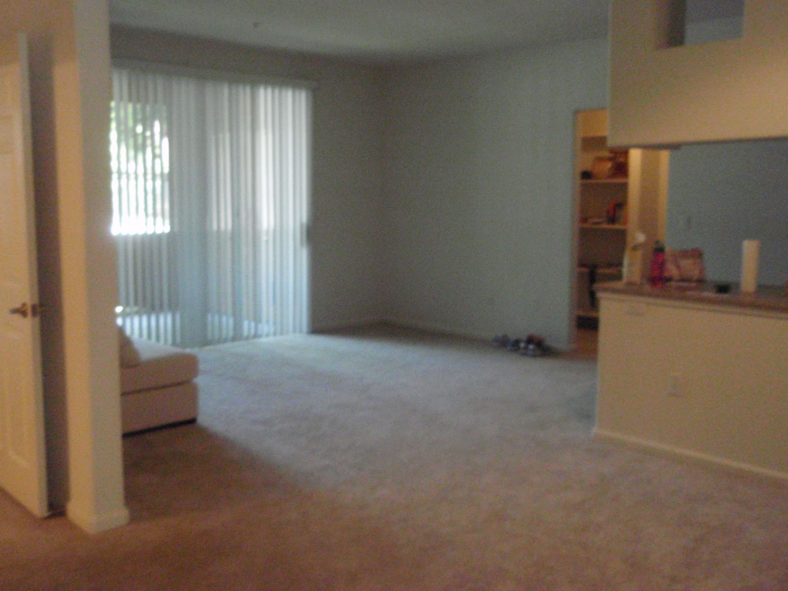
Living Room
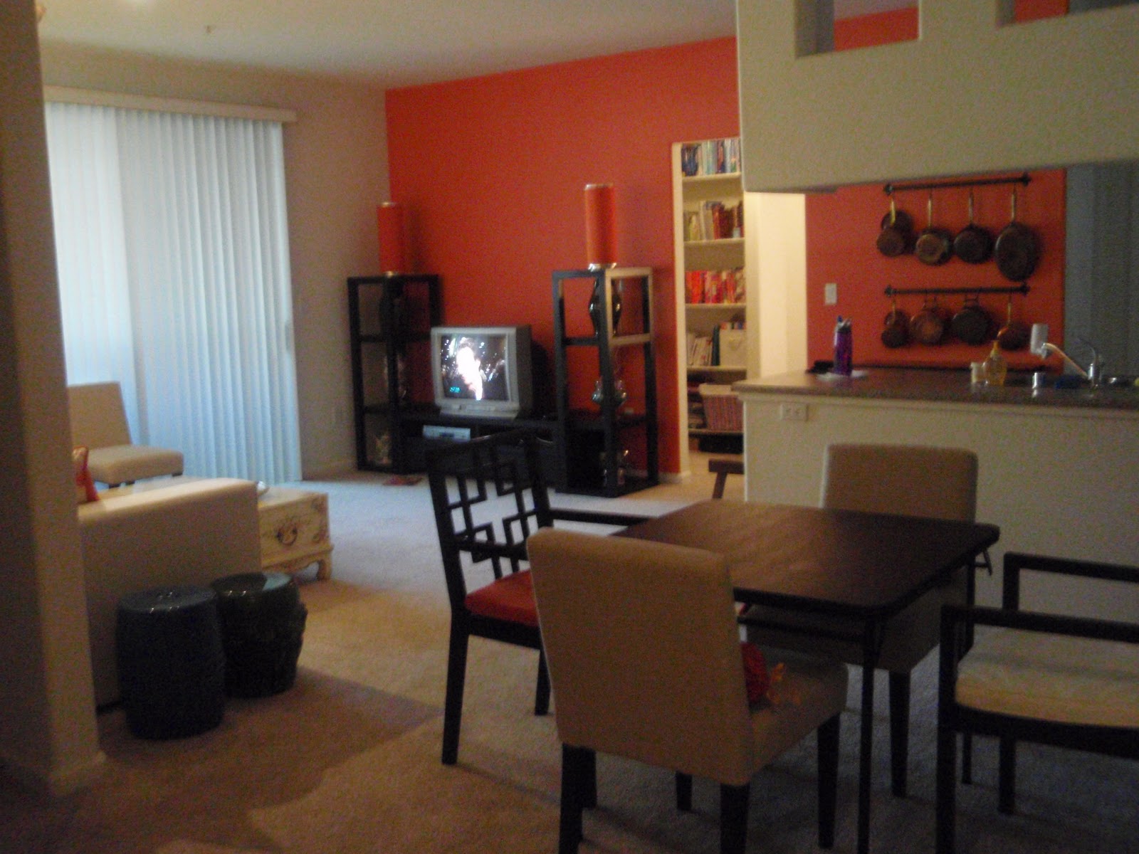
Inspiration. When we first moved into our apartment in San Diego, I was adamant that we pick a color scheme and paint the walls before all of belongings arrived from San Diego. After spending countless hours on the Internet, I finally decided on Liz Claiborne’s Extrovert Peach Blossom. I loved the big bold pattern and variety of colors. My plan was to use the fabric throughout the entire house, but emphasize different colors in each room. In this Living Room, I planned to emphasize the orange by using Liz Claiborne’s Soane (suede-like fabric) Piquant.


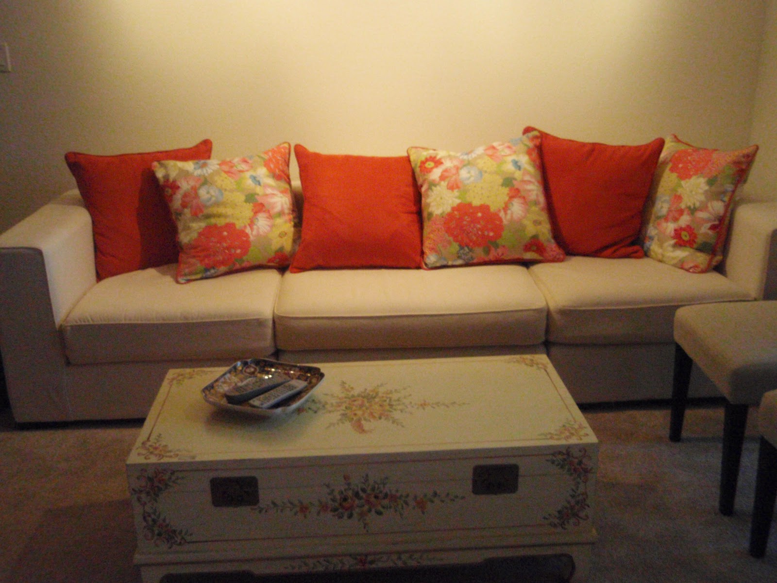
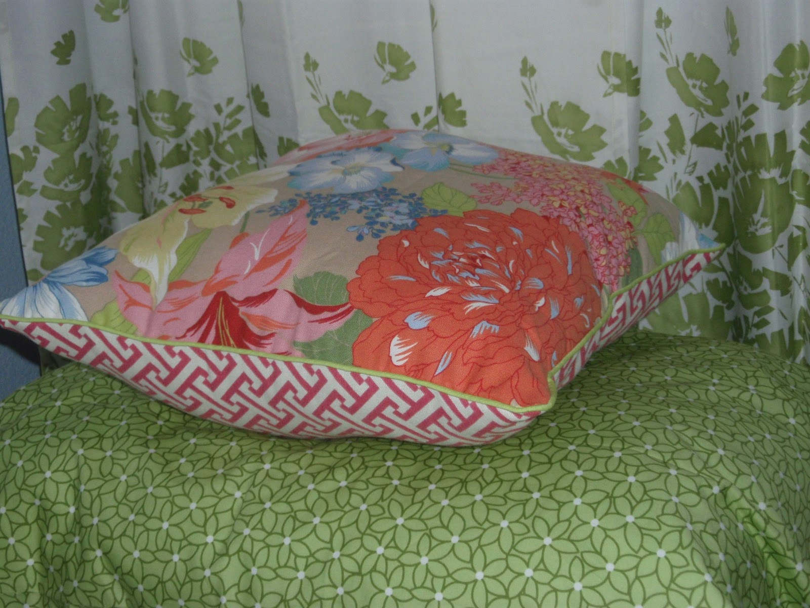
Pillows. We purchased this sectional couch from West Elm, and each unit came with two pillows. To add a punch of color and introduce our theme fabrics, I covered each pillow. 3 of the pillows were flowered on both sides with custom orange piping around the rim. The other 3 pillows had flowers on one side and plain orange on the other, also with the orange piping around the edge. Adding the solid orange on 3 of the pillows was a great way to tone down the “loudness” of the flowered fabric across the whole couch!
Curtains. The fabric for these curtains was an absolutely score! Although I wasn’t looking to introduce another pattern, the combination of orange, green, yellow and taupe was a perfect match to the flowered fabric. I found this fabric on the clearance table at JoAnn’s; it was $6/yard plus an extra 50% off. I bought all that was left on the bolt, which was only about 6 yards. Because our sliding class doors had hanging blinds, I didn’t necessarily need curtains that closed so these curtains became purely decorative. With the fake cornice, however, I was dumbfounded on how to actually hang the curtains. Do I hang a rod above the doors? Do I replace the blinds with fabric? Then I had a stroke of genius! I simply put adhesive Velco on the inside of the cornice and put the other side of the Velcro on the top of my pleated panels. These hung perfectly without the hassle of hanging rods, and they provided a perfect pop of color to complement our color scheme.

Art. These are the same frames that hung above the futon in my husband’s lounge in Okinawa. We replaced his Iraq pictures with our favorite snapshots of our travels while oversees. We then purchased poster-size cardstock in taupe, orange, green, and yellow, and cut out mats for each frame. We then (painstakingly) hung the pictures in an arrangement that not only altered the layout of the photos (landscape versus portrait) but also altered pictures of scenery and faces.

Track Lighting. This room had no overhead light, so we purchased these track lights from IKEA. Although they were a pain to instal, they really did highlight the pictures nicely (ignore the crooked frames and mess of a couch!).
Tables. Our two garden stools, one blue and one green, made quaint and contrasting end tables (difficult to see in the picture). Our coffee table was a light yellow painted trunk from China. Inside the trunk was our DVD collection! Love using trunks with built in storage as tables!

Accent Wall. We painted the opposite wall a fabulous orange (Lowe’s “Clay Pot”). I would have never imagined painting a room orange, but this wall was small enough that it worked and brought such vibrancy to the space. We got so many complements on our orange wall! To finish this side of the room, we purchased this modular entertainment center (also from West Elm), and orange lanterns from IKEA.

- Although bright and refreshing, using such a bold color as orange made it very difficult to decorate for other seasons. For example, it was awkward to use red at Christmas and Valentine’s Day because it just looked busy and uncoordinated.
- It pays to spend the time finding a fabric that really works with your space and your belongings. We already had the yellow trunk and blue and green garden stools. Although our color scheme became orange and yellow, the fabric still allowed us to use pieces we already owned.
- Both the couch and the entertainment center are modular. It becomes very easy to buy furniture for the space you’re in, but we knew this furniture needed to work in many other future homes. Having units that separate give us the flexibility to make it work in any space we find ourselves in!
Master Bedroom


Master Bathroom

Guest Bedroom
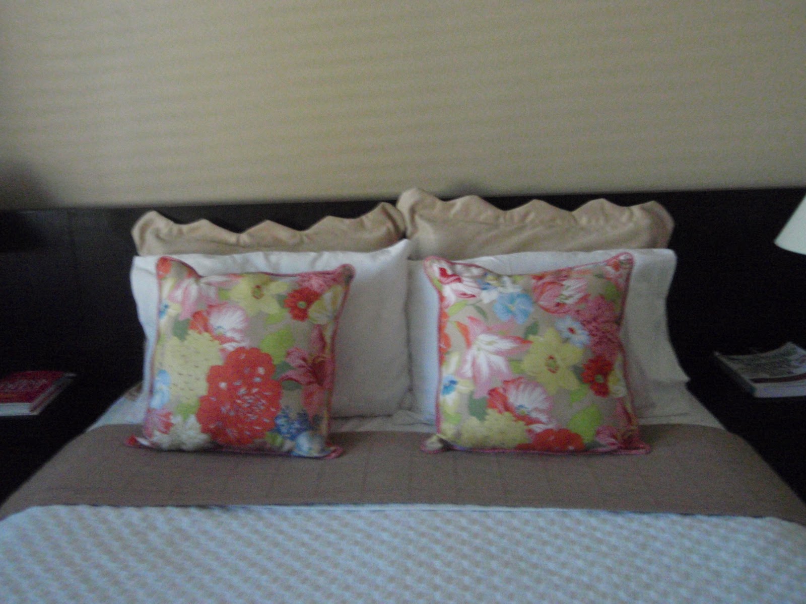
Inspiration. Again, I wanted to use Liz Claiborne’s Extrovert Peach Blossom fabric to coordinate with the rest of the house, but this time I chose to accentuate the green and blue. I ended up introducing a blue and green stripe, as well as some pink geometric fabric to try and bring it all together. I really struggled to bring this room together, and don’t think I was ever quite successful. But, like with so many of my projects, I learned a lot!


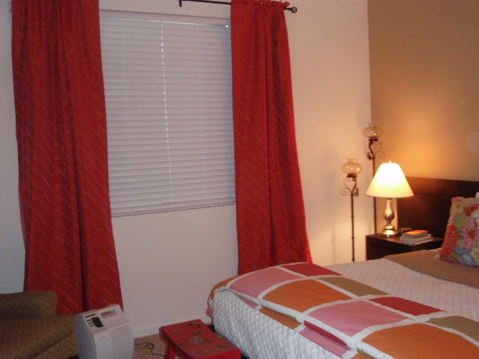
Curtains. The windows in this room made positioning the furniture quite a challenge. Admittedly, we were probably trying to squeeze too many pieces in. Nonetheless, there was no great place to put the “headboard” so I made a small, useless window the focal point of the bed. I found these curtain panels at Bed, Bath, and Beyond. They were way too short, so I knew I wouldn’t use them as curtains. Instead, they worked perfectly behind the bed to soften the room and serve as a faux headboard.
Bedding. I found another white quilt (just like my C&B one!) at Marshals (Love!). It was a queen size, but I just tucked and tucked and tucked it under this twin mattress and box spring! The sheets were a splurge: Amy Butler bedding. The quilt at the foot of the bed was also bought at Linen’N’Things Going-Out-Of-Business clearance sale!
Pillows Sham. I made the pillow sham using my striped fabric to tie all the greens to the blue wall. I cut out two shams, but because it was a twin bed, I only made one. (The other is still cut out and ready to be assembled in my “to-do” box!) I followed this pattern to make it: XXXX.

Bedskirt. I thought this was one of my more clever ideas (if I do say so myself!). I bought a cheep taupe bedskirt with clean lines and simple pleats at the corners and in the middle. I then cut scraps of my Liz Claiborne theme fabric to fit the insides of the pleats. Using fusible webbing, I ironed the fabric into the pleat for a pop of unexpected pattern and color!
Want to save this post?

Window Valence. The window valence was a very simple rectangle sewn out of cheep white fabric. I added green borders to three sides and left openings on the top/sides for the rod to go through. Then I constructed simple “tie backs” (essentially, big loops) out of my striped fabric to coordinate with the bedding.

Lamp shades. Here is where I started to loose my focus – maybe? I added in the pink geometric fabric. I did it because I was in love with the pattern and I thought the green/blue was a little flat. Although I loved the pink, I think this is where the room began to derail! Regardless though, I learned how to cover lamp shades and fabric boxes! The lamp shades were covered using my accent fabric with a glue gun. Should have definately trimmed the tops and bottoms (on both the in and outside) with a trim to cover the rough edges – especially when the light is on! Duh!


Message Board. To tie the patterns together, I needed to bring in my main flowered fabric. I chose to do so in a message board. This is a huge piece of painter’s canvas, covered in fabric. I then used a glue gun to adhere a clip board (decoupaged with scrapbook paper), a magnetic wipe board, and a cork board. Note – hot glue was NOT strong enough and I was constantly putting this board back together. Hurumph! But it sure looked cute!

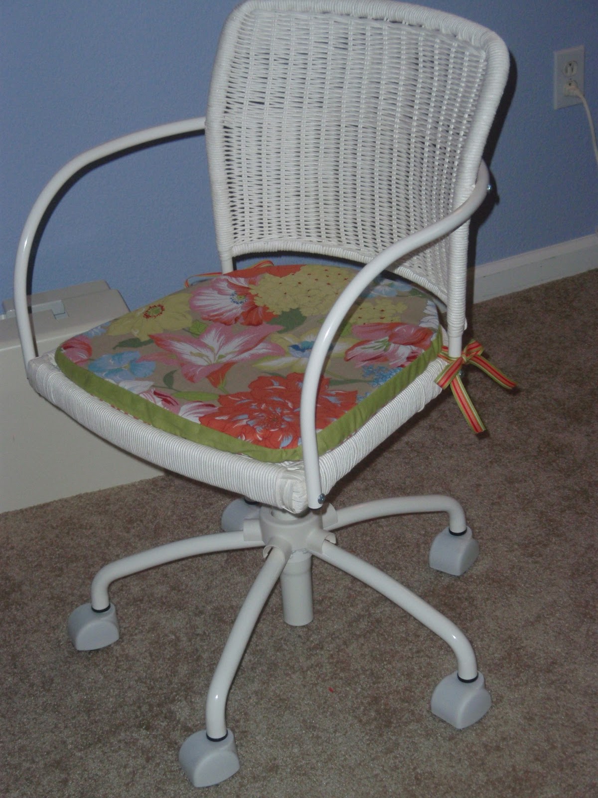
Chair Cushion. I also brought in the theme fabric with the chair cushion on the desk. I simply used the cushion that came with the chair as a pattern. The top was my flowered fabric, the underside was my accent pink fabric, and the middle band was my plain green. I used ribbons in the corners to keep the cushion tied to the chair!


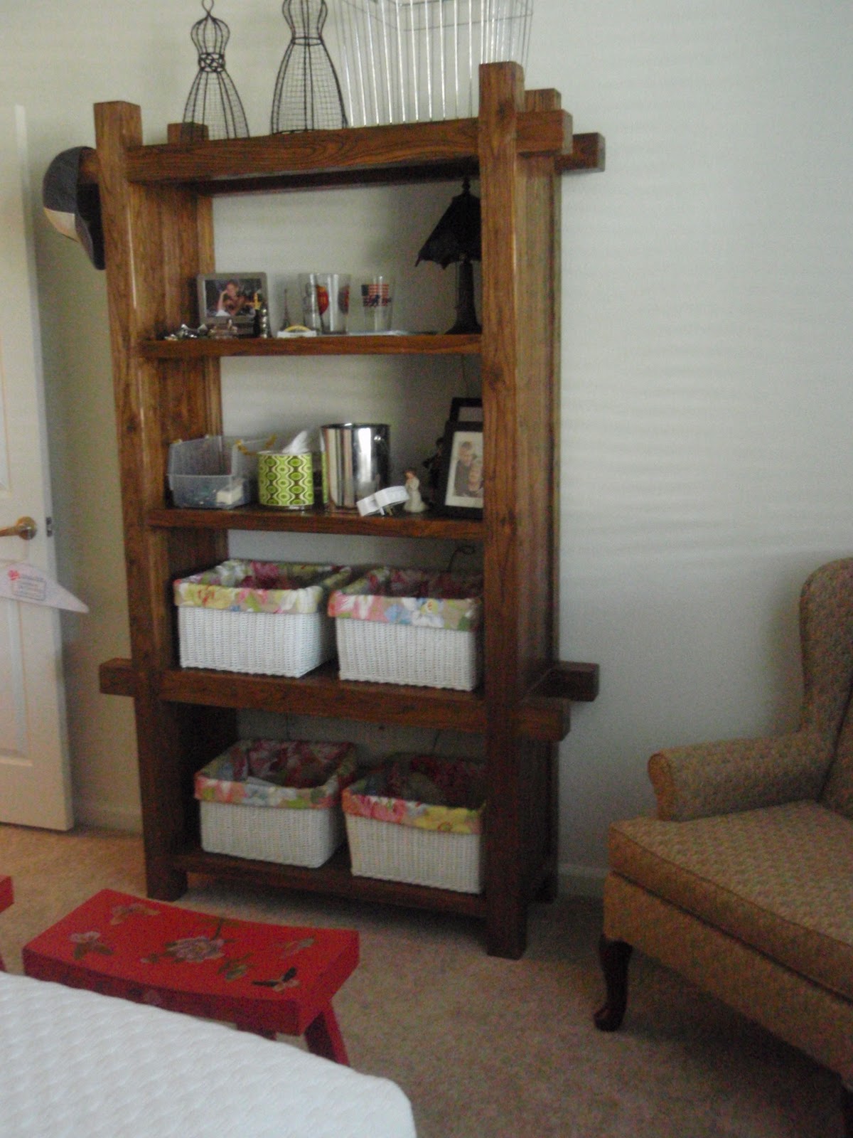
Craft Closet. Since this apartment was a small, two-bedroom unit, this room had to serve as office, guest room, and craft room. The closet, therefor, became my craft storage space. We used the modular shelves (also seen here) and stacked them in the side and back of the closet. My Y100 bins came in handy again, allowing me quick access to my supplies as I needed them!

Guest Bath Towels. Our guest bathroom was blah – I never really “decorated” it, but I did spruce up some plain towels for our guests to use. The blue and taupe towels were trimmed with a coordinating ribbon, and the plain white towels were given a strip of my flowered theme fabric.
Patio
Before leaving Okinawa, I bought up way too many a few of these spectacular ceramic pots from a Japanese pottery center. In the months prior to our move off the island, they sat like this:

When we arrived in beautiful, sunny San Diego, I was so excited to use my pots to make an outside oasis in our urban condo. Not knowing much about plants, I walked (we lived across the street) over to Lowes and bought a variety of plants that grew in the shade as our patio received no direct sunlight.
After a Saturday afternoon of work with my husband, out patio looked like this!

Notice this fantastic bench was the same one I used inside back in Okinawa. We also were able to find homes for our Japanese Rice God, our ShiShi dogs, an Owl, and a few other garden items!

Lastly, we also had this random pot rack lying around our garage (I had originally bought it for my mother who then decided she didn’t want it). Our kitchen wasn’t conducive to a hanging pot rack, and I did NOT want it lying around the garage…so look at our clever idea!

We simply lined the bottom with this hay-like moss and then padded the sides with some rubber gardening something-or-other 🙂 We filled the rack with soil and planted easy-to-grow philodendrons! The effect was spectacular and we were so proud of our clever use for our pot rack!
Megan
2 Comments on “Our Apartment Tour: Mission Valley, San Diego”
My living room wall is a terra cotta orange. It's fun to ride, in the car, down the street and see the wall thru our kitchen window. We have just one wall too. I agree about the holidays though. It's only good for the fall and not good for Christmas etc. The other walls are a soft creamy yellow that works with everything. It's been like this for 5 years and still holding up. Eventually I'll repaint that wall.
Was this a rental? I would love to be able to paint my rental, but I am too scared to ask! Thanks for all the peeks at the homes where you have lived. This is my second home with my army man.
Jenny