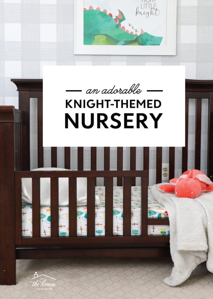
“Little Knight” Nursery Reveal
One of the very first projects I completed upon moving into this home three years ago was the mobile to hang over our then-due-any-day baby’s crib. Although this room veeeeery slowly evolved in the years since then (especially as our baby grew and his needs changed), it’s now an oh-so-charming room featuring a fresh color palette, a unique Knight theme, and a bunch of budget-friendly DIYs to bring it all together. As I snapped these final room pictures, it occurred to me this is the final nursery I will ever design and decorate (at least for my own family); and I can’t help but feel like I’m going out on a super sweet note. Let me show you around!
Before
This nursery space is actually a “sitting room” conjoined with our Master Bedroom through a set of pocket doors. While not a huge room, the 10′ x 14′ dimensions and close proximity to our bedroom made it the ideal place for our new baby.
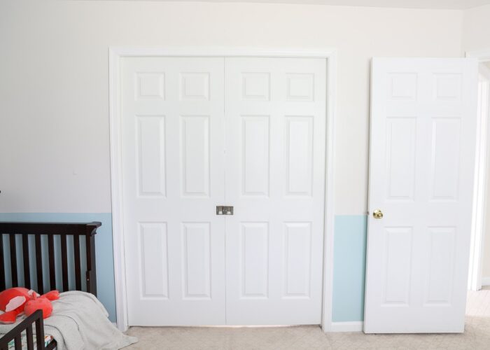
NOTE! Those pocket doors were indeed awesome when we had a newborn and I was heading in there multiple times a night. But they’ve been trouble pretty much ever since. They provide very little noise and light blocking and do not lock or latch at all, meaning our now adventurous toddler loves to throw them open in the middle of the night or whenever he wants us!
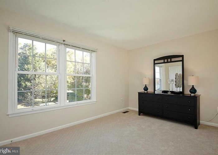
Upon moving in, the room was painted the same beige color as the rest of the house and had the same beige wall-to-wall carpeting. Before the moving truck even arrived, I set to work getting it ready for our new baby (who was quite literally due any day!)
The Design Plan
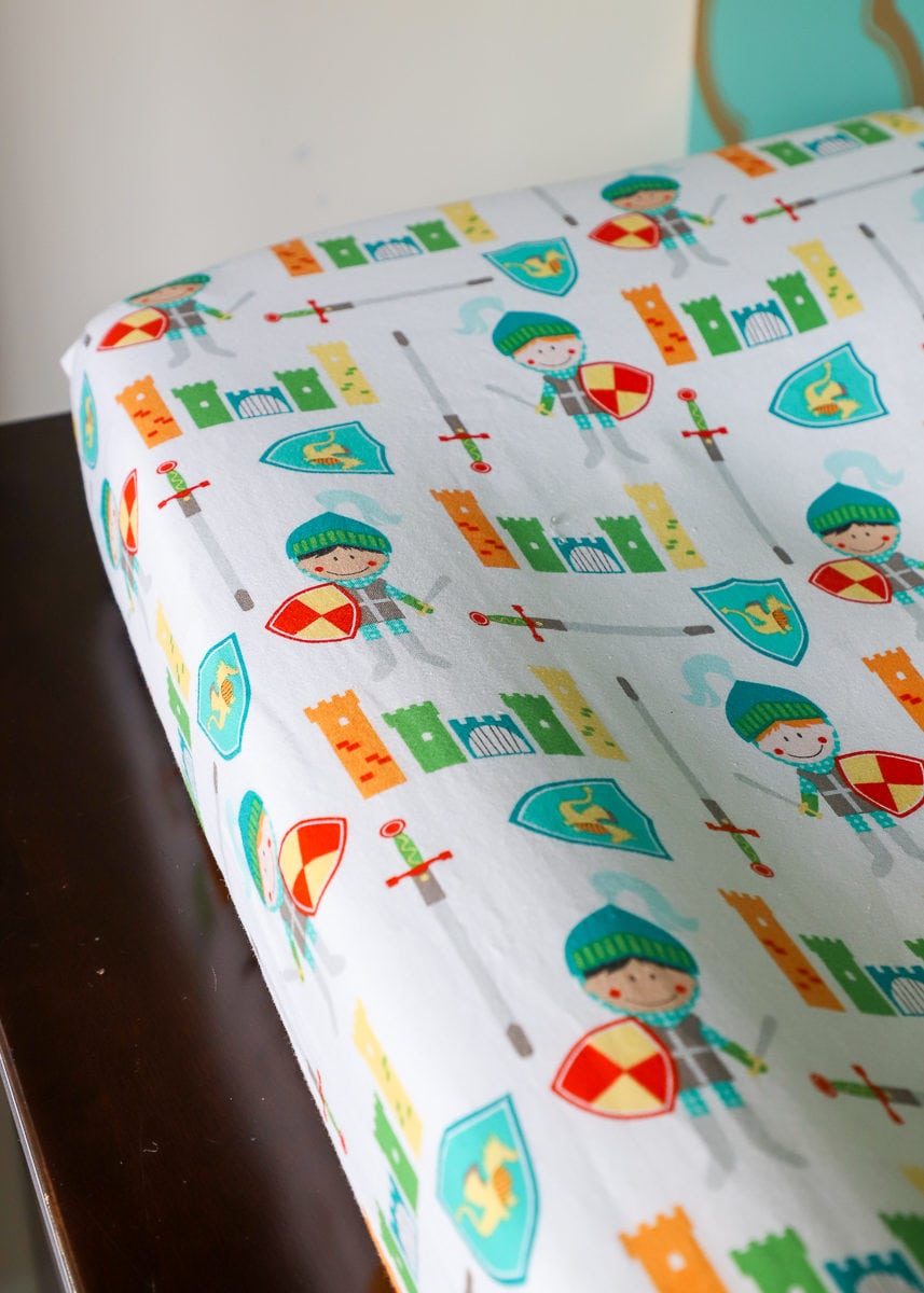
Early on in my nursery scheming and dreaming, I found and immediately fell in love with this sweet “Good Knight Retro” fabric by Michael Miller. Even though it wasn’t at all the color scheme or theme I originally had in mind, I just couldn’t move on from it.
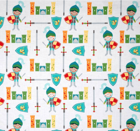
So I crafted up a design plan that played up the blues and greens in the fabric and embraced the Knight theme through artwork and other accessories.
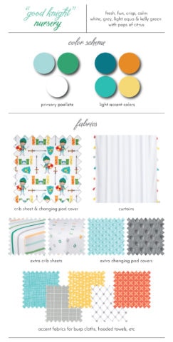
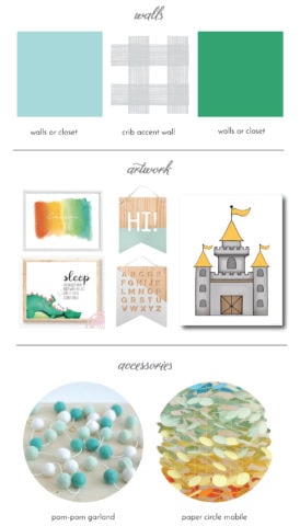
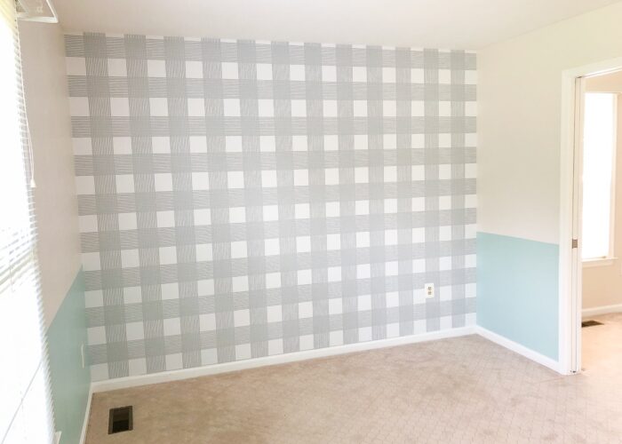
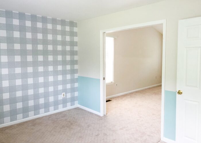
Almost immediately after receiving the keys to our house, my nephew helped me wallpaper the feature wall and paint the remaining walls in Sherwin Williams Marshmallow (white) and Tidewater (light turquoise).
I then spent the following three years adding things, removing things, and settling on things until everything felt just right. Come on and in and take a look!
After
Video Tour
Before I give you the full tour in pictures, below is a video tour of this completed room. The short video gives you a good sense of how and where everything fits together! Video not loading for you? You can watch it HERE.
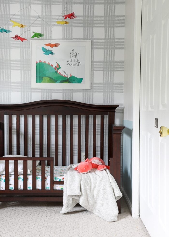
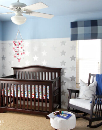
The Crib
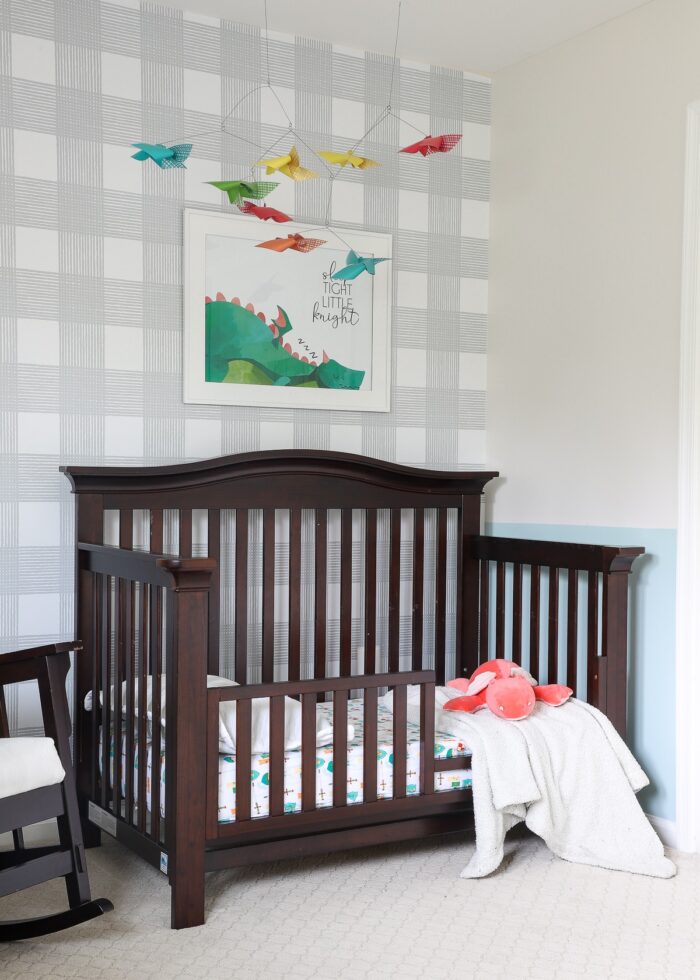
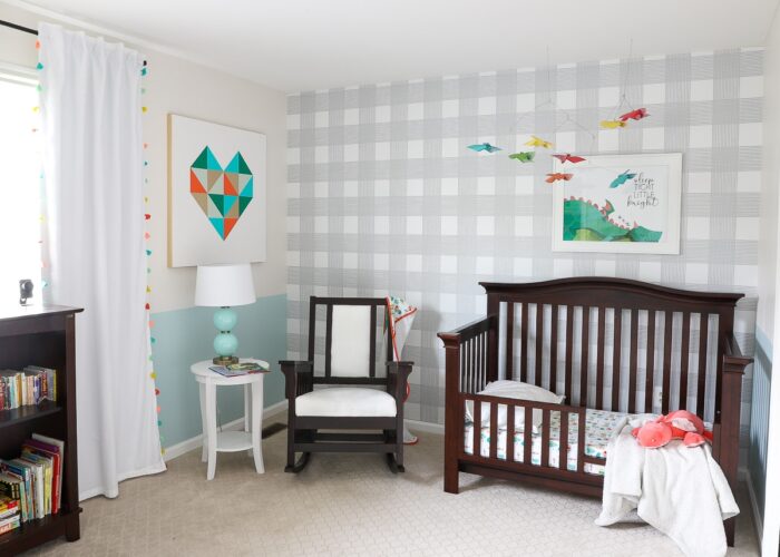
When you walk into the room, one of the very first things you see against the plaid feature wall is the crib.
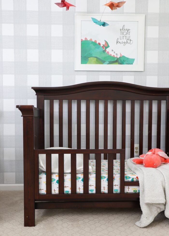
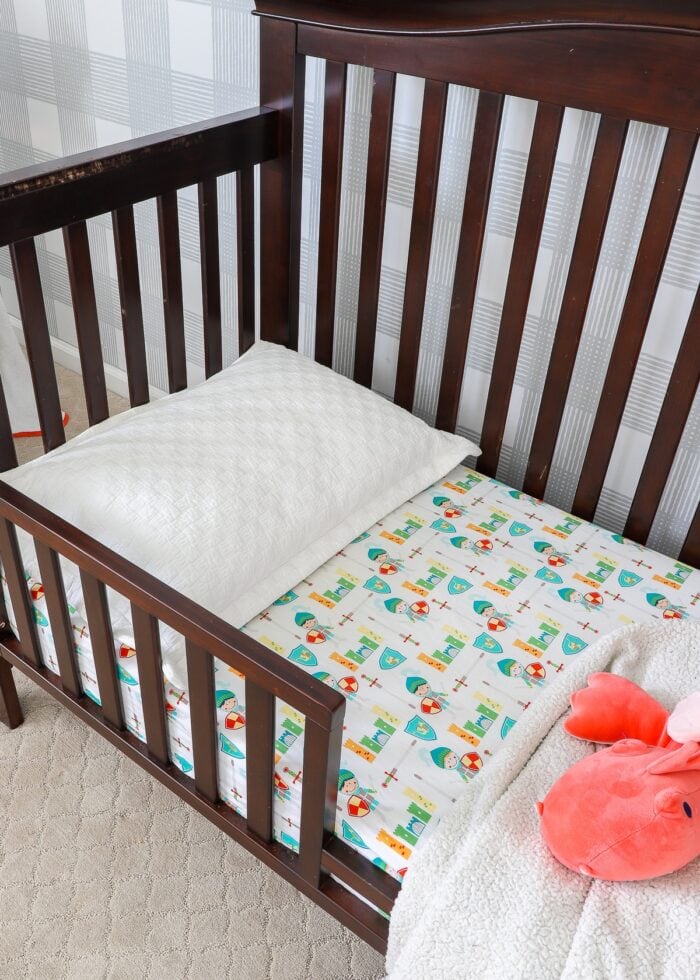
We started with the mattress up high, then we dropped the mattress as our baby grew, and we just recently installed the toddler rail (since we’ve now exhausted all options for keeping aforementioned adventurous toddler inside his crib). All along, the crib sheet I made out of the original Knight fabric has held strong!
FUN FACT! We bought this entire nursery set from a local shop when our oldest was born (11 years ago!). If you look at every nursery I’ve done over the years, you’ll see it. But we’re now the end of an era, and it will all be sold before we move out of this home!
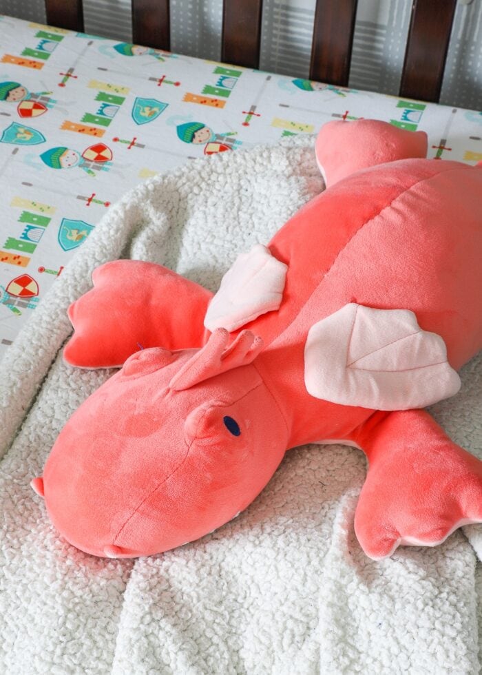
The plush, weighted dragon was a super lucky find at Target years ago, and he’s been in this room from the night we brought baby boy home! Everyone loves him; and for a long time, he was our son’s pillow.
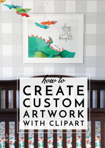
Above the crib hangs a dragon print I designed myself and printed inexpensively from a photo site. (See More: How to Design Your Own Artwork with Clipart)
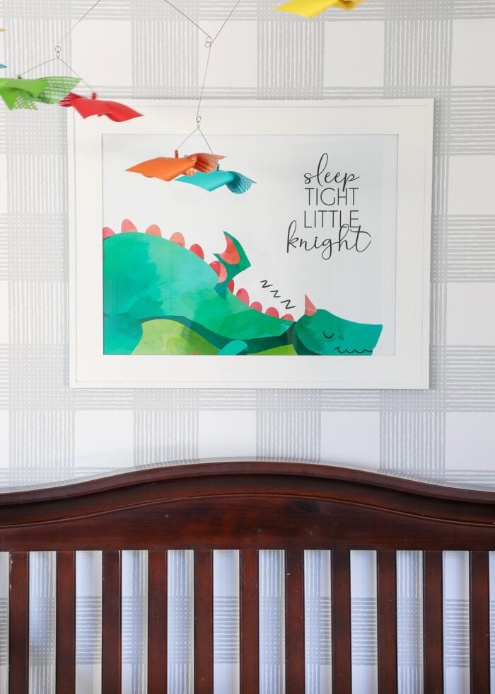
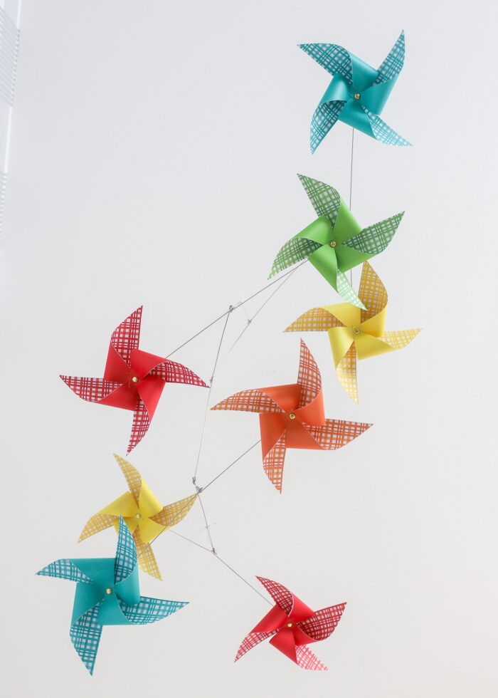
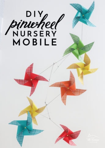
Mounted to the ceiling is that mobile I made pretty much as soon as my craft supplies came off the moving truck! All these years later, it’s in excellent condition, and I still see Jack watching it when the air moves the pinwheels around! (See More: DIY Paper Pinwheel Mobile)
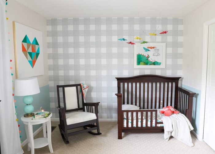
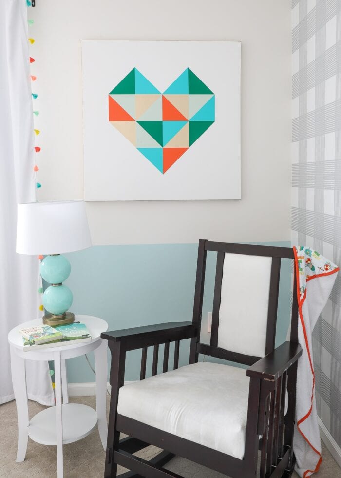
The Reading Corner
With a pocket door taking up one full wall and a window on the other, we had to get a smidge creative with furniture placement. So while not ideal, we placed the rocking chair (for feedings and reading) in the corner opposite the crib.
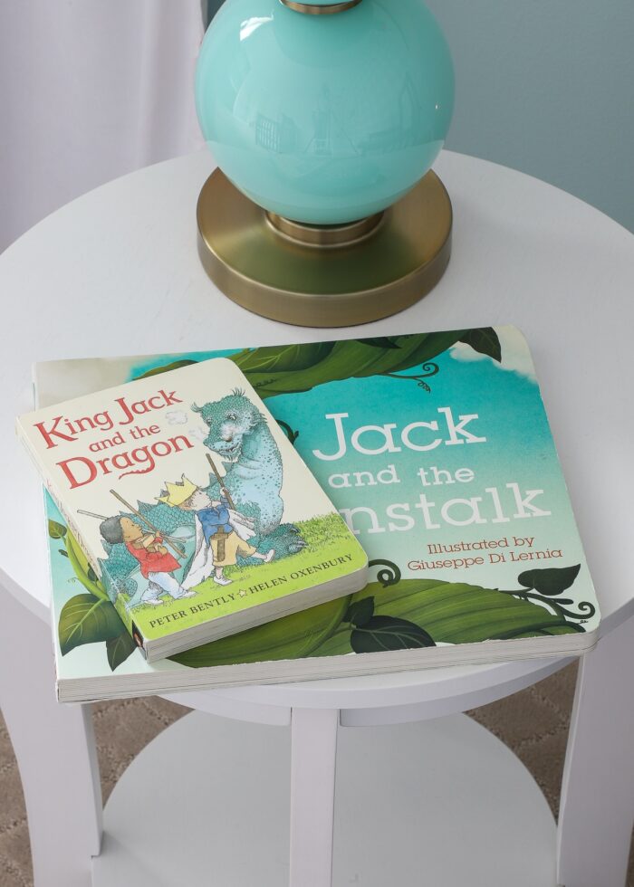
In the beginning, this corner was outfitted with nursing pillows and bottle parts and burp cloths; and the two-tiered table (similar) was perfect for holding everything we needed. Now, this is simply where we cuddle and read books before bedtime.
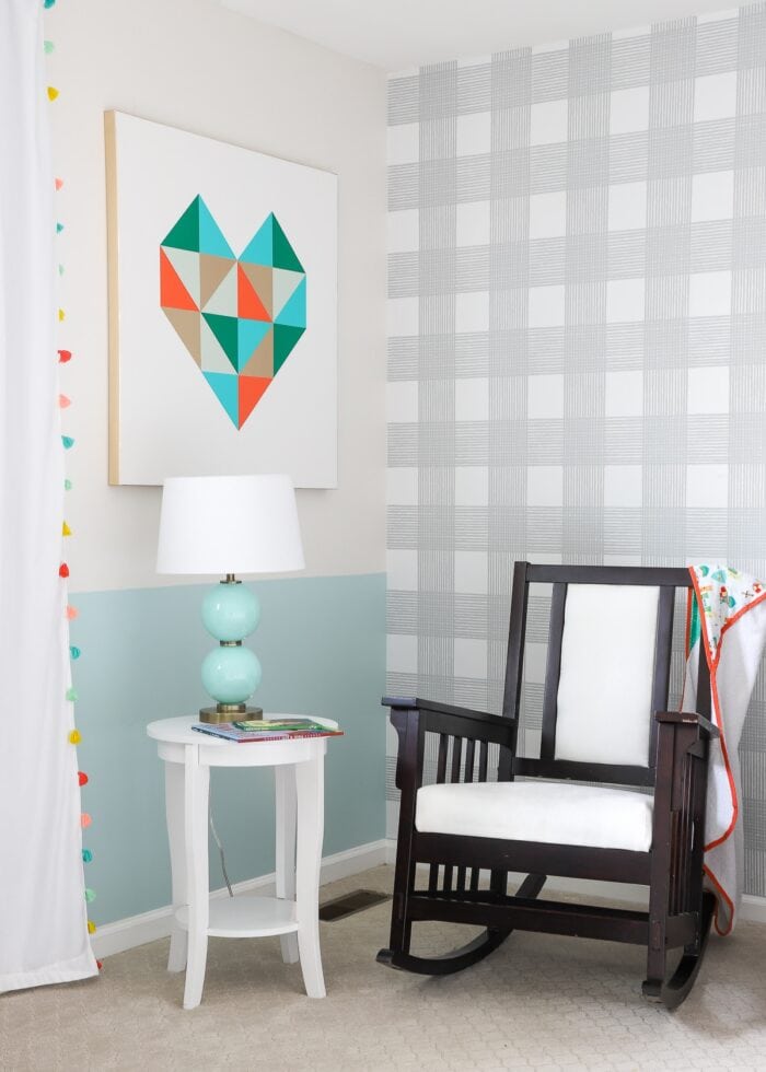
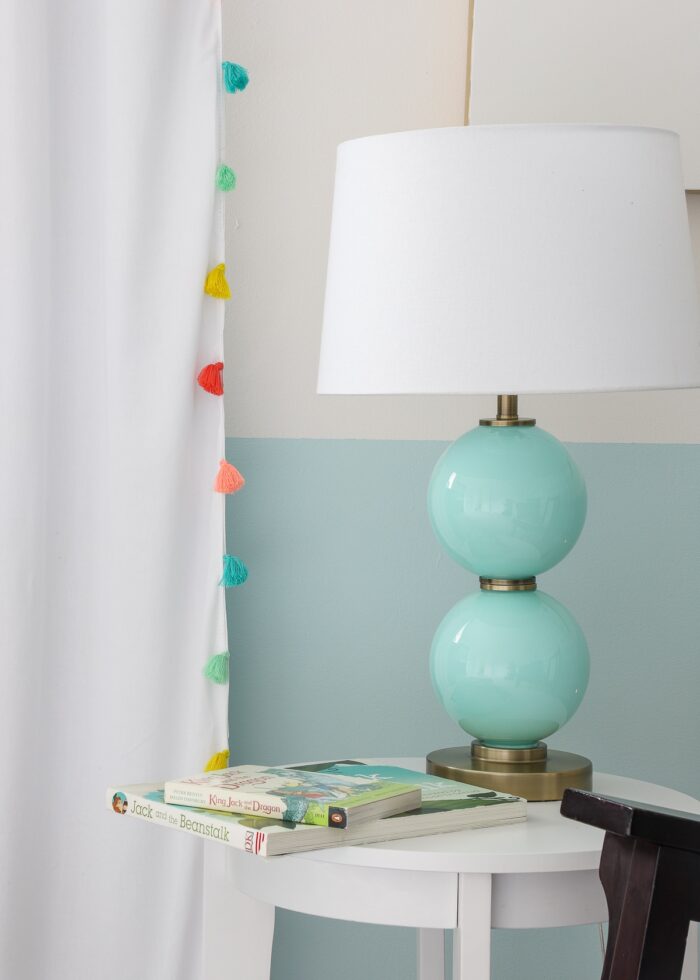
When our middle son was a baby, we learned how handy it was to have a touch lamp so you don’t have to fiddle with switches and knobs in the middle of the night. This brass-and-turquoise lamp (similar) is also a touch-sensor lamp and is easily one of my favorite things in the room (I just love it when things look amazing and are super functional too!)
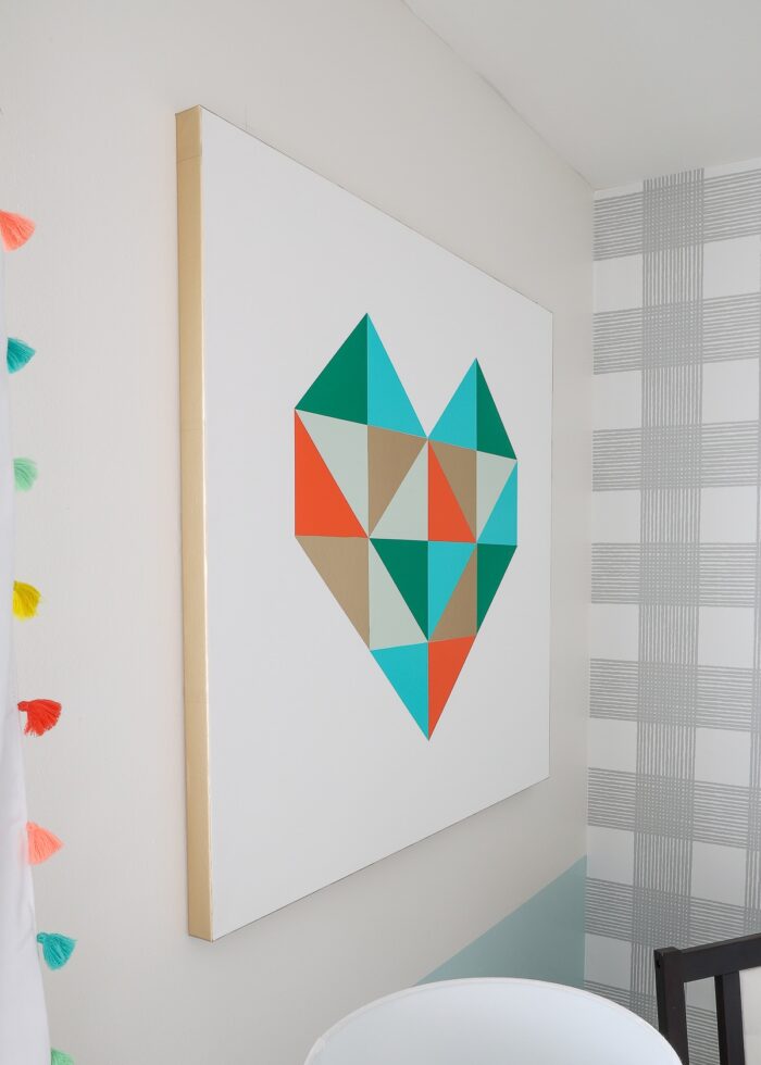
Eagle-eyed readers will notice that new art hangs in this corner of the room above the rocking chair. While I loved the original prints we had here, their scale always felt too small.
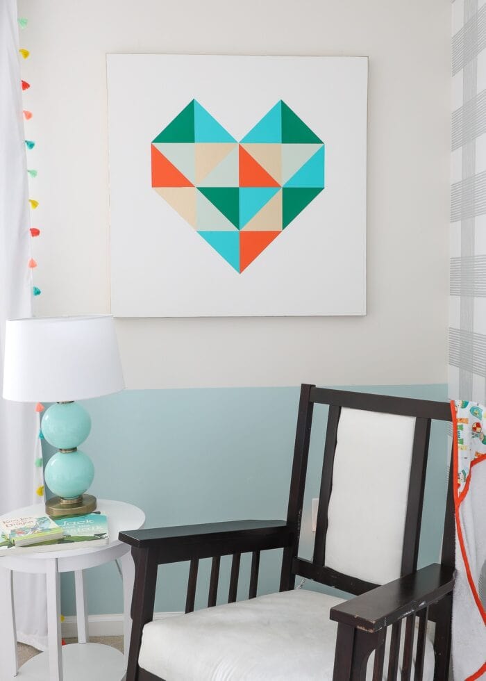
I replaced the smaller prints with this over-sized DIY heart artwork, and it immediately made this whole corner “click.”
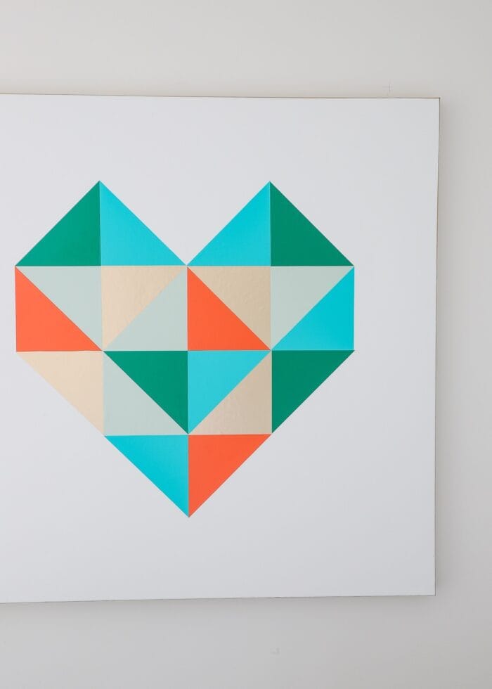
You’re seriously going to LOVE how easy and cheap this artwork is, so keep an eye out for the full tutorial coming soon!
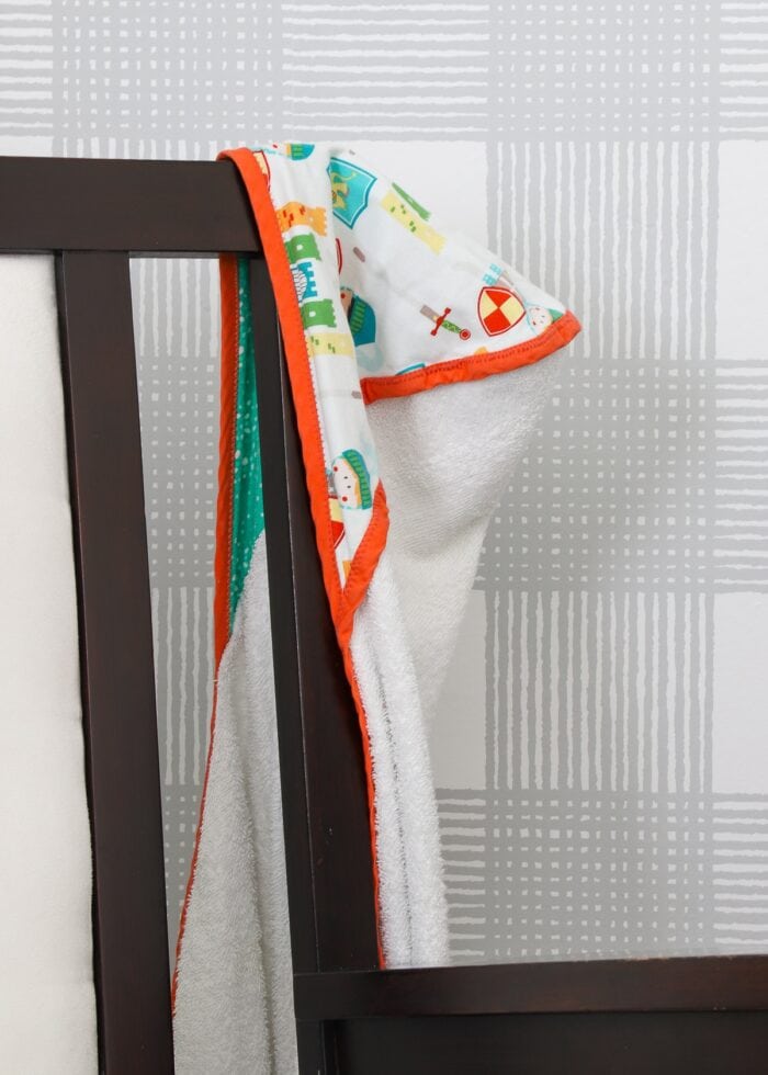
You might also catch a peek of another household tradition hanging on the rocking chair: a hooded bath towel made from the Knight fabric. I’ve made these hooded towels for all of my baby’s when they’re born (and it’s my main baby shower gift too!). We continue to use the towels for years and years (Henry’s original one has been replaced, but Sam’s is going strong!)
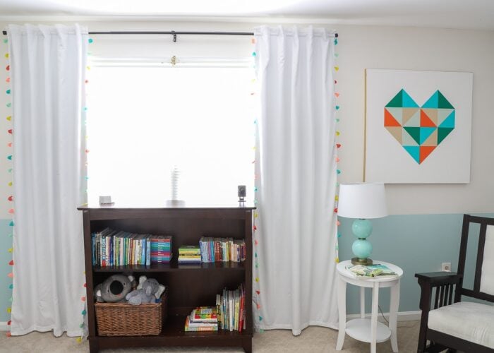
The Window Wall
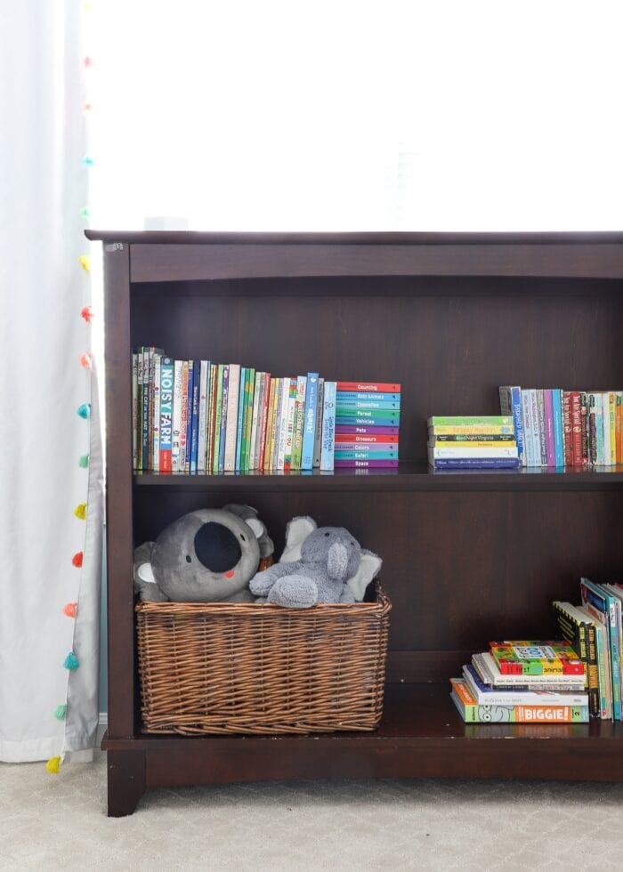
As you continue to turn around the room, you come to face the single set of large of windows that look out over the backyard. I typically don’t like placing furniture in front of windows, but we had little choice in this room. Thankfully, we made the entire arrangement look intentional by framing out the bookcase in the most adorable curtains ever.
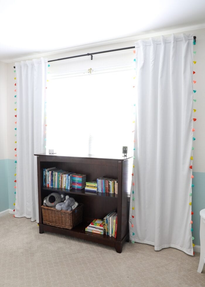
This bookcase is actually the hutch for the top of the nursery dresser. Depending on what kind of space we have, we sometimes stack them (like in Sam’s Nursery) or split them apart. Placing the hutch directly on the floor in this layout allowed us to create a nice focal point in front of the window, while also keeping all the books and stuffies down on kid level.
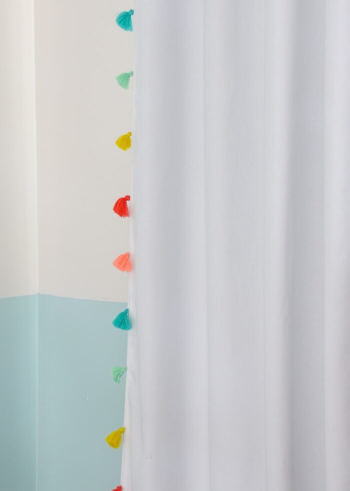
A quick comment about the adorable tassel curtains (which are no longer available in this specific color scheme). I actually have a love-hate relationship with these curtains. Because they are lined and hemmed really wonky, they do not hang nicely. No matter what I do to “train them,” they will not pleat and hang uniformly. They always have this very casual look to them, which just isn’t my style.
However, I’ve kept them in place all this time because of those bright, happy tassels. They might seem subtle, but I’ve been amazed at how much they bring everything in the room together. No matter which direction you look, their colors peek out, and they connect every other detail. So often, it’s little details like this that make a room feel extra special!
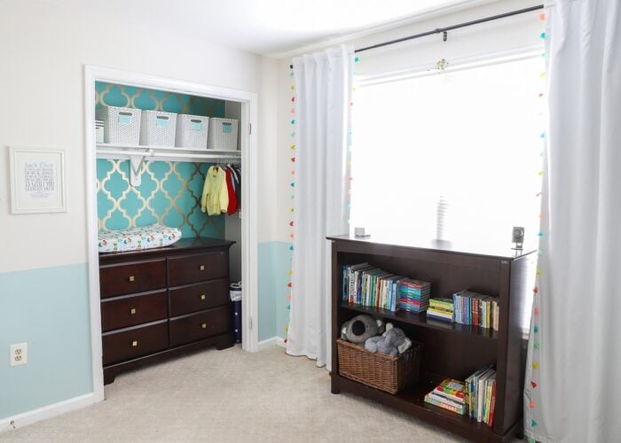
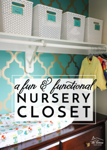
The Nursery Closet
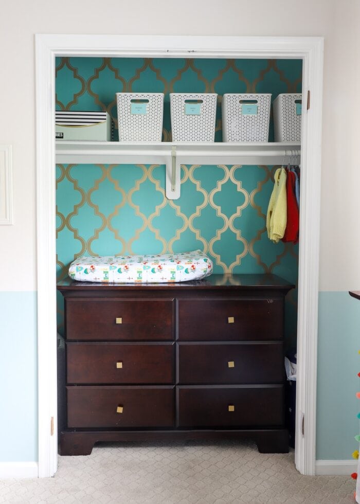
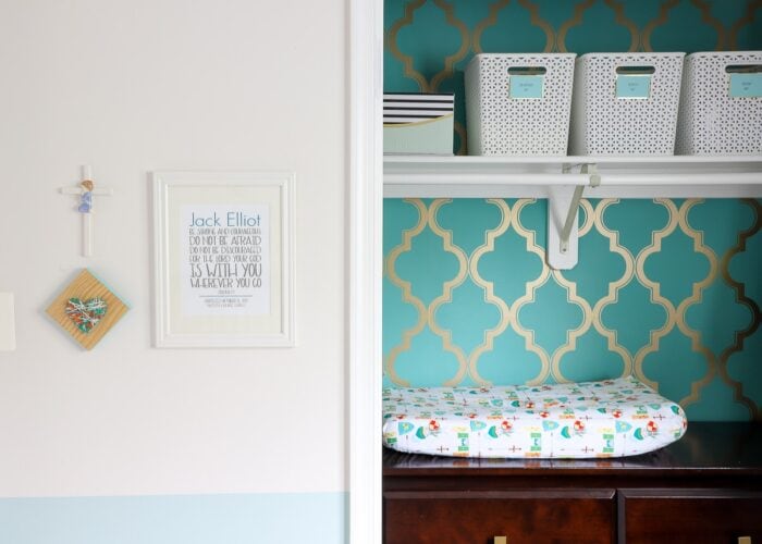
The final corner of this room is one I first shared pretty early on in this makeover. With all other walls used up, the closet was our only option for the clothing storage. Thankfully, by removing the closet’s doors, we were able to fit the nursery dresser inside and create the ultimate hub for diaper changing and baby clothes!
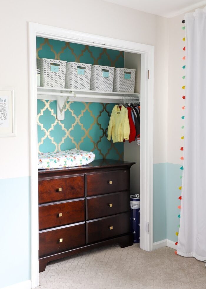
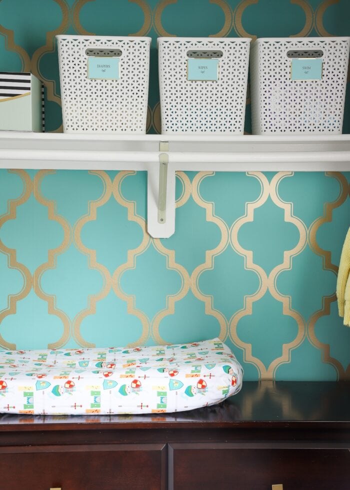
Before moving the dresser in, I lined the back wall with some wallpaper rolls I found on clearance. Although not really planned or intentional, the trellis pattern nodded to the Knight/castle theme used throughout. The metallic details in the paper also helped add some shimmer and shine to this darker side of the room and tied in with the lamp and art in the other corner.
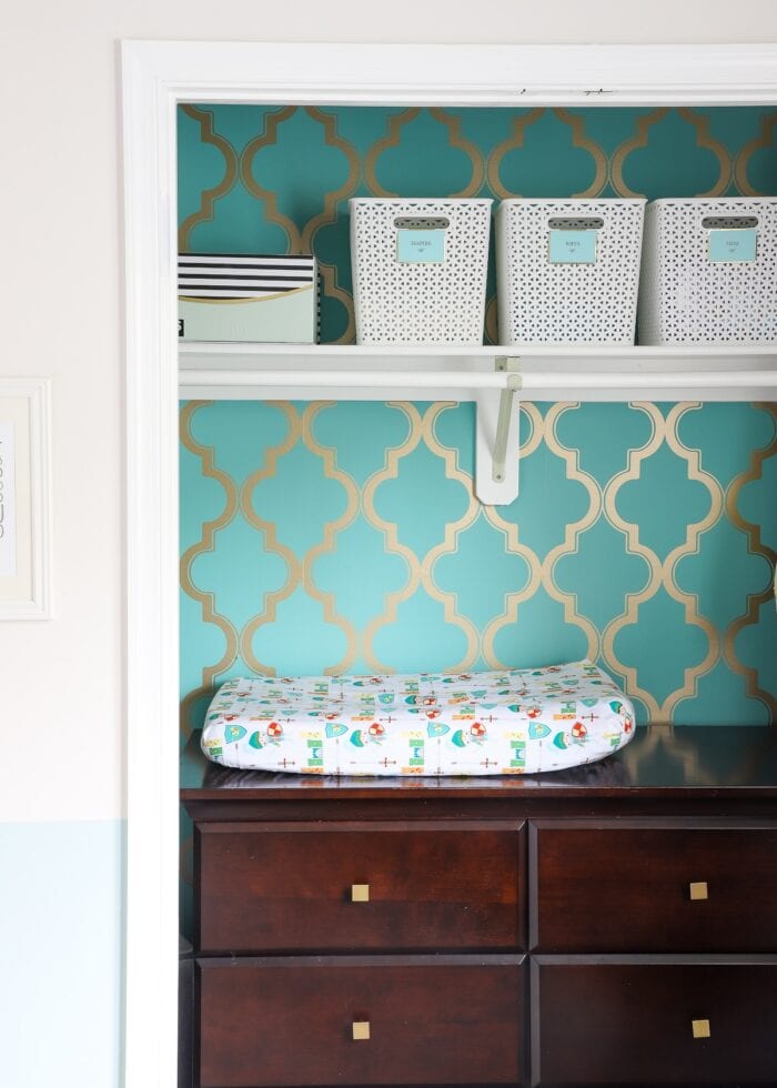
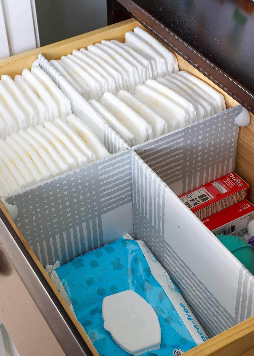
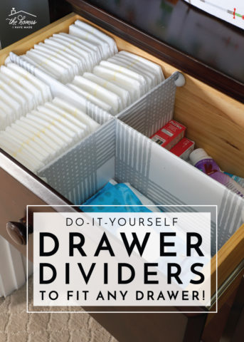
The changing pad cover coordinates with the crib sheet, also done in the Knight theme fabric…
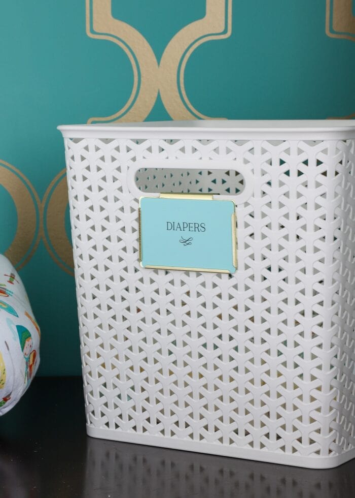
…and on the shelf above, I placed my trusty Y-Weave Baskets to corral items like extra diapers, wipes, swim gear, and clothes that become too small.
Finally, the dresser underneath was made extra functional with the addition of easy DIY drawer dividers, and dressed up a bit with lined drawers and new knobs.
To the right of the dresser is the diaper pail and to the left is the hamper.
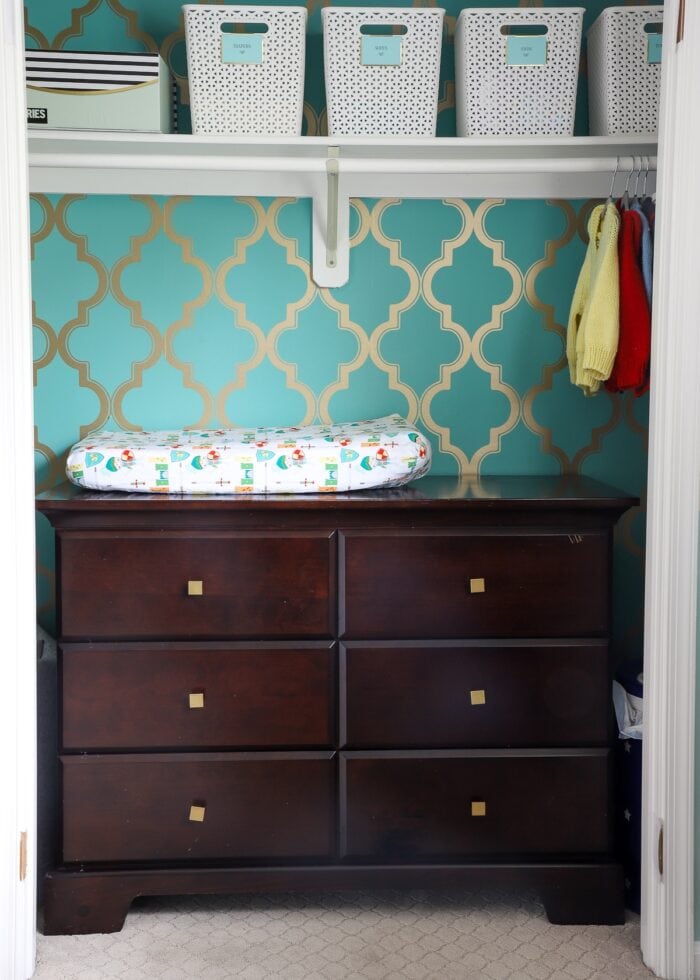
So all together, this closet uses space in a super smart and efficient way, creating a one-stop-shop for getting ready every morning and every night. And it sure looks pretty too!
Products & Tutorials In This Room
Here are all the products and projects seen in this space!
(Unfortunately, many items are no longer available, but I linked similar options when possible!)
- Walls
- Textiles
- Knight Fabric
- Tassel Curtains – the exact color scheme I used is no longer available
- Furniture
- White Side Table – similar
- Gold Square Drawer Knobs
- Artwork
- Dragon Print
- Heart Canvas – tutorial coming soon
- Mobile Hanging Kit
- Storage
- Accessories
- Weighted Dragon – the dragon is no longer available, but there are some other cute choices!
- Touch-Sensor Lamp – exact lamp is discontinued, here is a great option!


As I was taking all these final photos, I found myself getting unexpectedly emotional. I very rarely get sad breaking down a house (I’m usually gung-ho and ready for the next one!). But it suddenly occurred to me that this is our final nursery.
I can so clearly remember finding the Knight fabric, and then discovering how well the tassel curtains worked with it. I remember showing my girlfriends the grey wallpaper I found on clearance and that giddy feeling you get when everything starts coming together. I looooove desinging kid spaces; and while there are plenty more of those in my future, the days of baby fabrics and cutesy themes are now behind me as a Mom.
Because this room came together soooooo slowly…I almost didn’t realize how charming it really had become. In fact, I kinda felt like it was the room that slipped away from me. But as I step back and take in all the details big and small, I’ve got aaaall the heart eyes for this cute little space that I made for my last little baby.
Megan

2 Comments on ““Little Knight” Nursery Reveal”
A little late to be of use to you now, but we had a similar problematic pocket door situation. We shut the door and blocked it with bookcases. You honestly can’t tell the door is there!
It looks wonderful, Megan!
I love how this turned out! I wish you lived by me and could give me tips to help my daughter’s themeless/undecorated room 😉